


URL Position Movers Report
URL Position Movers compares every URL’s impression-weighted average position between two periods and plots the move — previous position against current position — so a page that quietly slid from #6 to #14 is as visible as one that jumped from #40 to #3.
URL Position Movement Size
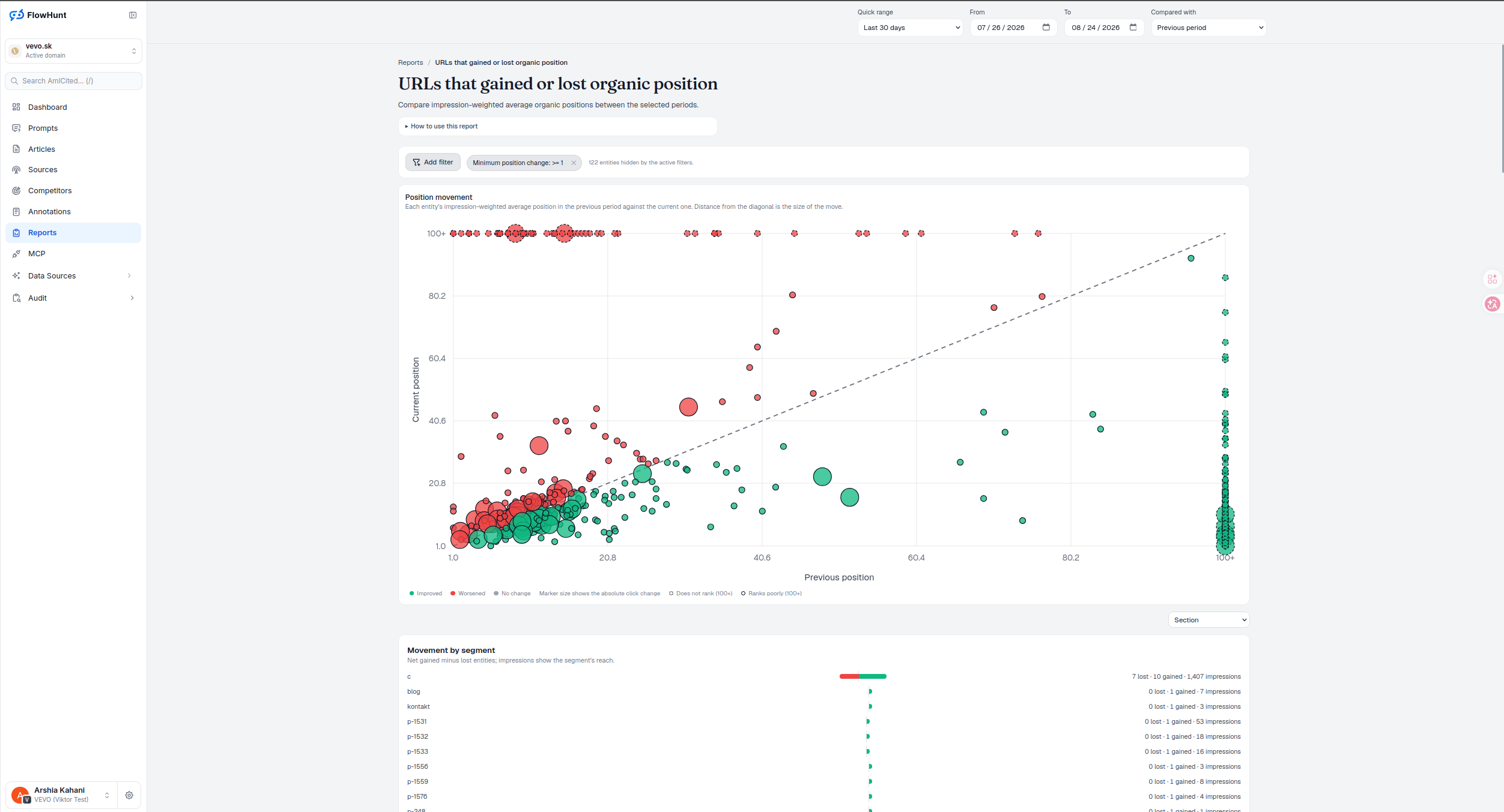
Each URL is a bubble on a previous-position-versus-current-position scatter, rank 1 at the origin, worse ranks extending right and up. The dashed diagonal is no change; green bubbles sit below it — improved, because a lower position number is better — red bubbles sit above it, worsened, and bubble size is the absolute click change that move produced, capped at the 95th-percentile magnitude so one outlier doesn’t flatten every other mark. A big red bubble near the top-left is a page worth checking today.
- Position movement scatter — previous position on one axis, current on the other, bubble size is the click change the move caused.
- Filter by direction, position or click threshold — improved/worsened, a minimum absolute position change (default 1, so single-decimal averaging noise doesn’t fill the chart), and a minimum absolute click change, all driving the charts, tables and CSV together.
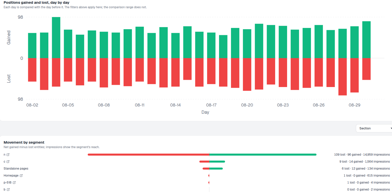
- Movement by segment — net gained minus lost URLs per section, with each segment’s impressions shown for reach.
- Segment position movement — the same previous-vs-current scatter, rolled up so a whole section’s shift is one bubble instead of hundreds.
- Segment crossing table — net gained minus lost, broken out by section and by position band (Entered, 1–10, 11–20, 21–50, 51+), symmetric around zero.
- Position impact chart — position improvement against click change for every URL ranked in both periods, so you can see which moves actually paid off in clicks and which didn’t.
- Full data table, exportable — URL, group (moved/entered/left), previous/current/change for position, clicks and impressions, all in one row, all downloadable as CSV.
- Drill into Search Console — a URL row opens the query explorer for that exact page, since a position scatter can’t tell you which queries carried the move.
URL Position Movement States
Every bubble is colored Improved (green), Worsened (red) or No change (gray), and two special rings mark the periods where a URL simply wasn’t ranking: Does not rank now (100+ on the current axis, dashed outline) and Ranks poorly before (100+ on the previous axis). A measured position beyond 100 lands in the same 100+ band but keeps a solid outline, so a genuinely absent URL is never visually confused with one that just ranks badly. That distinction matters — a brand-new page climbing from nowhere reads differently than an established page losing ground.
- Improved / Worsened / No change — the core three states, colored consistently across every chart on the page.
- Does not rank (100+) — a URL absent from one period gets plotted at the edge instead of silently excluded.
- Bubble size = click change — the biggest bubbles are where the position move actually cost or earned clicks, not just rank.
- Break down by Device or Section — the scatter and every table below it re-filter to the dimension you pick.
- Readiness, not a silent blank — a running import, a pending mart rebuild, a credit pause and an import error each get their own notice, so an empty chart never reads as an empty site.
URL Position Impact Chart
Position Impact plots position improvement (previous minus current) on one axis and click change (current minus previous) on the other, zero-centered on both, for every URL ranked in both periods. The four quadrants read as their own verdicts — gained position and gained clicks in the top right, lost both in the bottom left, and the two off-diagonal quadrants where position and clicks moved in opposite directions, which is exactly where an AI Overview, answer box or format change is worth suspecting before a content rewrite. Bubble size is the larger impression count of the two periods, not the smaller, so a page’s full reach — not just its current one — sets how much attention it gets.
- Four quadrants, four verdicts — gained position/gained clicks, lost position/gained clicks, gained position/lost clicks, lost position/lost clicks.
- Entered means no prior impressions, Left means none now — so the missing-side clicks and impressions for those URLs are true zero, not unknown, wherever they show up in the table.
- Full table underneath — URL, Group (Moved/Entered/Left), and Previous/Current/Change for Position, Clicks and Impressions, all in one row, sortable on every column.
- Export CSV — take the exact table, filters applied, into a spreadsheet or a ticket.
- Entered and Left called out, not hidden — the count of entities found in only one period is shown above the chart so the exclusion is never a silent one.
URL Position Movement by Directory
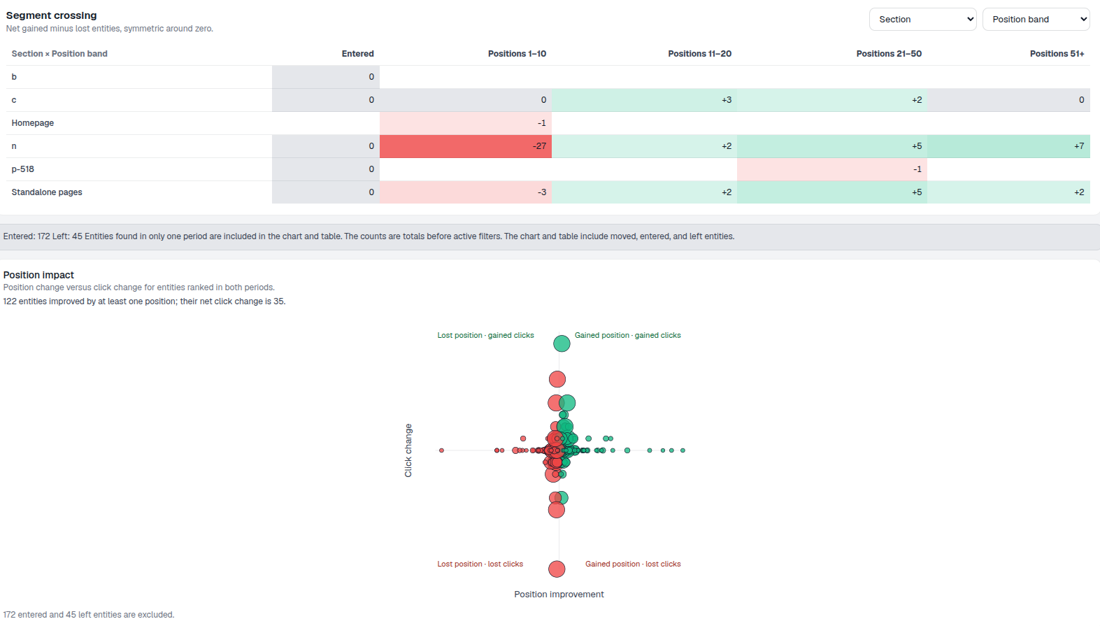
This window, the c section posted ten gains against seven losses across 1,407 impressions — the only segment with real net movement. Every other active section shows a single URL gained and nothing lost, which reads as isolated page-level change rather than a directory-wide shift. That distinction is exactly why Movement by segment exists: it’s the fastest way to tell a template or navigation problem (many URLs, one section) apart from a handful of individually-edited pages.
- Net gained minus lost, not raw counts — a section can have both gains and losses; the bar shows what’s left over.
- Sorted strongest net move first — the section most worth investigating is always at the top.
- Impressions shown alongside — a section’s reach for scale, since a big net move on a low-impression section matters less than a small one on a high-impression section.
- All positive this window — no section lost more than it gained, so nothing here points to a broad regression right now.
entities hidden by default until you widen the filter
A minimum-position-change filter starts active so the scatter opens readable. Loosen it, or clear it, to see every one of the urls that gained or lost organic position, by any amount — the hidden count is always shown so nothing is silently dropped.
See Keyword Position MoversTrack URL Position Changes
Previous position against current position, bubble size for click impact, and a segment breakdown by section — so a whole-directory shift is visible before you open one page.
Ready to see which pages actually moved?
Free check · 7-day trial · card required