Data Visualization
Data visualization is the graphical representation of data using charts, graphs, and dashboards. Learn how visual data transforms complex information into actio...
13 min read
An infographic is a visual representation of information, data, or knowledge that combines imagery, charts, graphs, icons, and minimal text to present complex information quickly and clearly. Infographics are designed to make data more accessible, engaging, and memorable by transforming dense information into visually compelling formats that audiences can understand at a glance.
An infographic is a visual representation of information, data, or knowledge that combines imagery, charts, graphs, icons, and minimal text to present complex information quickly and clearly. Infographics are designed to make data more accessible, engaging, and memorable by transforming dense information into visually compelling formats that audiences can understand at a glance.
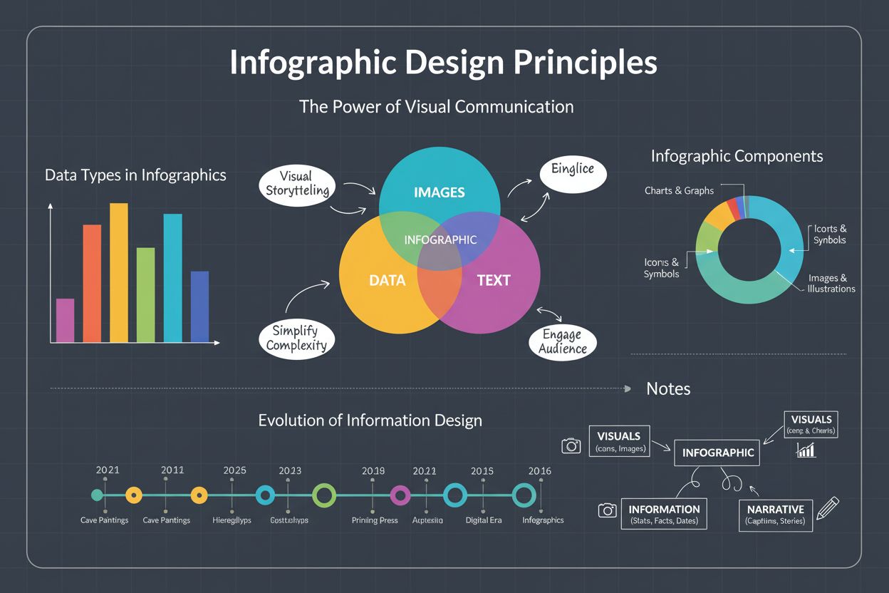
An infographic is a visual representation of information, data, or knowledge that strategically combines imagery, charts, graphs, icons, and minimal text to present complex information quickly and clearly. The term “infographic” derives from “information graphic,” and according to the Oxford English Dictionary, it represents a visual format specifically designed to communicate data and concepts in an accessible, engaging manner. Infographics transform dense, complicated information into visually compelling narratives that audiences can comprehend within seconds, making them invaluable tools across education, marketing, business intelligence, and public communication. Unlike traditional text-based documents or lengthy reports, infographics prioritize visual elements to enhance comprehension, improve information retention, and increase audience engagement across digital platforms and social media channels.
The infographic emerged as a dominant communication format approximately 15 years ago, coinciding with the rise of digital media and social platforms. As organizations increasingly recognized the limitations of text-heavy communication in capturing audience attention, infographics evolved into a standard tool for presenting data, explaining processes, and building brand awareness. The proliferation of infographics reflects broader cognitive science research demonstrating that the human brain processes visual information 60,000 times faster than text, and visual content constitutes 90% of the data transmitted to the brain. This scientific foundation has driven widespread adoption across industries, with 65% of brands now incorporating infographics into their content marketing strategies. The evolution of design tools, data visualization software, and AI-powered infographic generators has democratized infographic creation, enabling organizations of all sizes to produce professional-quality visual content without requiring specialized design expertise.
Infographics function through the strategic integration of five essential design elements that work synergistically to communicate information effectively. Visual hierarchy establishes a clear structure that guides viewers’ eyes through information in a logical sequence, ensuring the most important data points stand out prominently. Data and facts form the informational backbone, presented through charts, graphs, statistics, and research findings that have been carefully curated and verified for accuracy. Graphics and icons serve as visual metaphors and supporting elements that reinforce the narrative without overwhelming the message, making abstract concepts tangible and memorable. Color and typography create visual cohesion through consistent color schemes and carefully selected fonts that enhance readability while maintaining brand alignment. Finally, concise messaging ensures that text is minimal, impactful, and directly supports the visual elements rather than duplicating information. Together, these components create infographics that are simultaneously informative, engaging, and aesthetically compelling.
| Aspect | Infographic | Data Visualization | Chart/Graph | Presentation Slide |
|---|---|---|---|---|
| Primary Purpose | Communicate complex information visually with narrative flow | Display data patterns and relationships | Show specific numerical data | Present multiple topics sequentially |
| Text Volume | Minimal, supporting visuals | Minimal, labels and legends | Minimal, axis labels | Moderate to substantial |
| Visual Elements | Icons, illustrations, charts, diagrams | Charts, graphs, heatmaps | Single or multiple data representations | Mixed media, text, images |
| Typical Length | Single page or vertical scroll | Variable, often single visualization | Single visualization | Multiple slides |
| Best Use Case | Explaining processes, summarizing reports | Analyzing trends, identifying patterns | Comparing specific metrics | Sequential storytelling |
| Shareability | Highly shareable on social media | Moderate shareability | Lower standalone shareability | Requires presentation context |
| Design Complexity | High, requires design expertise | Moderate, technical focus | Low to moderate | Moderate, presentation skills |
| Audience Engagement | 94% higher views than text content | Varies by complexity | Moderate engagement | Context-dependent |
Infographics encompass diverse formats, each optimized for specific communication objectives and data structures. Statistical infographics prioritize numerical data, using bold fonts, charts, and graphs to highlight key metrics and trends, making them ideal for research presentations, annual reports, and data-driven marketing campaigns. Informational infographics provide detailed explanations of complex topics through structured text, icons, and illustrations, serving educational purposes and simplifying unfamiliar concepts for diverse audiences. Timeline infographics display events or milestones in chronological order, making them essential for historical narratives, project planning, and organizational milestones. Process infographics break down step-by-step workflows and procedures, using flowcharts and sequential visuals to guide audiences through complex processes such as manufacturing, software development, or customer journeys. Comparison infographics highlight similarities and differences between multiple options, products, or concepts, facilitating decision-making and competitive analysis. Geographic infographics map data to specific locations, enabling regional analysis and location-based insights. List infographics organize information hierarchically, transforming lengthy lists into visually engaging formats that improve comprehension and retention. Each type serves distinct strategic purposes and is selected based on the nature of the information being communicated and the target audience’s needs.
Creating effective infographics requires adherence to established design principles that balance aesthetics with functionality. Visual hierarchy must be established through strategic use of size, color, positioning, and typography to guide viewers’ attention toward the most critical information first. Clarity is paramount—every element should serve a purpose, and unnecessary details should be eliminated to prevent cognitive overload. Simplicity ensures that the design remains clean and uncluttered, allowing audiences to extract key insights without distraction. Consistency in color schemes, font selections, and layout patterns reinforces brand identity and improves visual coherence. Data accuracy is non-negotiable; all statistics, percentages, and facts must be thoroughly researched, verified, and properly cited to maintain credibility and trustworthiness. Audience-centric design requires understanding the target demographic’s preferences, knowledge level, and information needs, ensuring the infographic resonates with its intended viewers. Contrasting colors should be employed strategically to highlight key information while fading less important details into the background. Text hierarchy utilizing three distinct font styles—one for main headings, one for section headers, and one for body text—creates visual organization and improves readability. Relevant visuals including icons, illustrations, and photographs should directly support the narrative rather than serving as decorative elements.
The business case for infographics is compelling and well-documented through extensive research and performance metrics. Organizations leveraging data visualization tools report exceptional returns on investment, with Nucleus Research demonstrating that BI tools with data visualization deliver an ROI of $13.01 for every dollar invested. Businesses using advanced data visualization are 24% more likely to achieve above-average growth, 19% more likely to identify trends impacting organizational growth, and report 28% faster decision-making speeds compared to organizations relying on traditional reporting methods. Infographics significantly enhance social media performance, with posts featuring visual content receiving 94% more views than text-only content, and infographics being 3 times more likely to be shared across social networks. Facebook posts with images generate 2.3 times more engagement than those without visuals, while video content on landing pages can increase conversion rates by up to 80%. Emails containing visual content achieve 42% higher click-through rates than text-only emails. From a business intelligence perspective, 82% of organizations using data visualization tools report improved understanding of company data, 63% of business leaders believe visualization helps identify insights that might otherwise be missed, and 77% state that data visualization simplifies complex data and makes metrics accessible to non-technical stakeholders.
Infographics have become indispensable components of modern marketing and content strategies across diverse industries and organizational sizes. Marketers utilize infographics to build brand awareness, boost engagement, and communicate complex value propositions to target audiences. Statistical infographics showcase company achievements, research findings, and market data on landing pages and downloadable resources. Process infographics explain product features, service workflows, and customer journeys in visually engaging formats. Comparison infographics help potential customers evaluate options and make informed purchasing decisions. Timeline infographics highlight company history, product evolution, and organizational milestones on about pages and corporate communications. Educational infographics establish thought leadership by simplifying industry-specific concepts and sharing valuable insights with audiences. Social media strategies increasingly incorporate infographics, with Pinterest and Instagram serving as primary distribution channels for visual content. Visual content generates 7 times higher conversion rates than any other content format, making infographics particularly valuable for conversion-focused marketing campaigns. Additionally, 65% of brands report that using infographics in client pitches increases engagement and understanding, while 53% of marketers employ interactive infographics to enhance audience engagement and encourage deeper interaction with content.
The infographic landscape continues to evolve in response to technological advancement, changing audience preferences, and emerging communication platforms. AI-powered infographic generators are democratizing design capabilities, enabling non-designers to create professional-quality visuals through automated design suggestions and template-based systems. Interactive infographics are gaining prominence, with 53% of marketers employing interactive elements to increase engagement and encourage deeper audience interaction. Animated infographics and motion graphics are becoming standard on digital platforms, with video content on landing pages increasing conversion rates by up to 80%. Data-driven personalization allows organizations to create dynamic infographics that adapt content based on viewer demographics, preferences, and behavior patterns. Accessibility considerations are increasingly important, with designers incorporating alt text, color contrast optimization, and readable typography to ensure infographics serve diverse audiences including those with visual impairments. Integration with AI monitoring platforms like AmICited enables organizations to track how infographics appear in AI-generated responses across platforms such as ChatGPT, Perplexity, Google AI Overviews, and Claude, providing insights into content authority and brand visibility in AI ecosystems. Augmented reality (AR) and virtual reality (VR) integration represents an emerging frontier, with 74% of marketers predicting that AR and VR will be integrated into daily life within five years, fundamentally altering how audiences interact with visual data. Sustainability-focused design and ethical data visualization are becoming priorities as organizations recognize the responsibility to present information accurately and avoid misleading visual representations that could manipulate audience perception.
In the context of AI-driven search and content discovery, infographics represent critical assets for brand visibility and authority establishment. As AI systems like ChatGPT, Perplexity, Google AI Overviews, and Claude increasingly generate responses incorporating visual references and citations, well-designed infographics enhance the likelihood of brand mentions and content citations within AI-generated outputs. Organizations can leverage platforms like AmICited to monitor how their infographics appear across AI platforms, track citation frequency, measure content authority, and understand how AI systems distribute and reference visual information. This monitoring capability enables data-driven optimization of infographic strategy, helping organizations identify which visual content formats, topics, and design approaches generate the highest AI visibility and citation rates. By understanding infographic performance within AI ecosystems, organizations can strategically develop visual content that aligns with AI system preferences and audience search behaviors, ultimately enhancing brand authority and visibility in AI-mediated information discovery environments. The integration of infographic monitoring into broader content strategy represents a forward-thinking approach to maintaining competitive advantage in increasingly AI-driven digital landscapes.
The primary purpose of an infographic is to communicate complex information in a visually engaging and easily digestible format. Infographics transform dense data, statistics, and concepts into visual narratives that audiences can understand quickly, typically within seconds. By combining imagery, charts, and minimal text, infographics enhance comprehension, improve information retention by up to 65%, and increase engagement across digital platforms and social media channels.
Research demonstrates that the human brain processes visual information 60,000 times faster than text, and visual content constitutes 90% of the data transmitted to the brain. Infographics leverage this cognitive advantage by presenting information through charts, icons, and illustrations, which are inherently more memorable than written descriptions. Studies show that visual content generates 7 times higher conversion rates than text-only content, and audiences retain visual information significantly longer than textual information.
The primary types of infographics include statistical infographics (focusing on data visualization through charts and graphs), informational infographics (explaining complex topics with detailed text and visuals), timeline infographics (displaying chronological events), process infographics (breaking down step-by-step workflows), comparison infographics (highlighting differences between options), geographic infographics (mapping data to locations), and list infographics (organizing information hierarchically). Each type serves distinct communication purposes and is optimized for specific data structures and audience needs.
Infographics significantly outperform other content formats on social media platforms. Posts featuring visual content receive 94% more views than text-only posts, and infographics are 3 times more likely to be shared across social networks. Facebook posts with images generate 2.3 times more engagement than those without visuals, while visual content on landing pages can increase conversion rates by up to 80%. This exceptional performance makes infographics a cornerstone of modern content marketing and social media strategies.
Effective infographics incorporate five essential elements: visual hierarchy (guiding viewers through information logically), accurate data and facts (presented in digestible formats), relevant graphics and icons (supporting the narrative), consistent color and typography (enhancing readability and brand alignment), and concise messaging (using minimal text). Additionally, effective infographics employ contrasting colors to highlight key information, use three distinct font styles for text hierarchy, and incorporate visual elements like charts, illustrations, and icons to make information memorable and engaging.
Organizations leveraging data visualization tools report substantial returns on investment. According to Nucleus Research, BI tools with data visualization deliver an ROI of $13.01 for every dollar invested. Businesses using advanced data visualization are 24% more likely to achieve above-average growth, 19% more likely to spot growth-impacting trends, and report 28% faster decision-making speeds. Additionally, 82% of businesses using data visualization tools report better understanding of company data, and 65% report increased client engagement when using infographics in pitches.
Infographics serve as authoritative visual content that AI systems frequently cite and reference when generating responses. As platforms like ChatGPT, Perplexity, Google AI Overviews, and Claude increasingly rely on visual content for context and citations, well-designed infographics enhance brand visibility in AI-generated responses. Monitoring infographic appearances across AI platforms through tools like AmICited helps organizations track brand mentions, measure content authority, and understand how AI systems distribute visual information, making infographics critical assets in modern AI-driven search and content discovery ecosystems.
Start tracking how AI chatbots mention your brand across ChatGPT, Perplexity, and other platforms. Get actionable insights to improve your AI presence.
Data visualization is the graphical representation of data using charts, graphs, and dashboards. Learn how visual data transforms complex information into actio...

Learn what charts are, their types, and how they transform raw data into actionable insights. Essential guide to data visualization formats for analytics and re...
Information Architecture is the practice of organizing and structuring content for optimal usability. Learn how IA improves findability, user experience, and co...