
Mobile-First Indexing
Mobile-first indexing explained: Google uses mobile versions for ranking. Learn why it matters, best practices, and how it impacts SEO and AI search visibility.
13 min read

Mobile usability refers to how easily and effectively users can interact with, navigate, and complete tasks on a website or application using mobile devices such as smartphones and tablets. It encompasses responsive design, page speed, touch-friendly interfaces, readable content, and overall user experience optimization for smaller screens.
Mobile usability refers to how easily and effectively users can interact with, navigate, and complete tasks on a website or application using mobile devices such as smartphones and tablets. It encompasses responsive design, page speed, touch-friendly interfaces, readable content, and overall user experience optimization for smaller screens.
Mobile usability is the measure of how effectively and intuitively users can interact with, navigate, and accomplish their goals on a website or application when using mobile devices such as smartphones and tablets. It encompasses far more than simply making a website “fit” on a smaller screen—it represents a comprehensive approach to designing and optimizing digital experiences specifically for the mobile context. Mobile usability includes responsive design principles, page performance optimization, touch-friendly interface elements, readable typography, intuitive navigation structures, and overall user experience quality on devices with limited screen real estate. In today’s digital landscape where 62.45% of global internet traffic originates from mobile devices, mobile usability has evolved from a nice-to-have feature into an absolute necessity for business success, search engine visibility, and AI search engine optimization.
The significance of mobile usability cannot be overstated in contemporary web design and digital marketing. With 91% of internet users accessing the web via mobile devices and 4.3 billion people worldwide using mobile internet, the mobile experience has become the primary way users interact with digital content. Google’s shift to mobile-first indexing in 2019, now the standard for all new web domains, fundamentally changed how search engines evaluate and rank websites. This means Google primarily uses the mobile version of your website for indexing and ranking, regardless of whether users are searching on desktop or mobile devices. If your site provides a poor mobile experience, it will negatively impact your rankings across all search contexts. Furthermore, mobile bounce rates average 50-60% compared to desktop’s 35-45%, indicating that users are significantly more likely to abandon mobile sites that don’t meet their expectations. The relationship between mobile usability and business outcomes is direct and measurable: a one-second improvement in mobile page load speed can increase conversions by 12% or more, while 90% of mobile shoppers abandon shopping carts due to friction in the mobile checkout experience.
The emergence of AI search engines like Perplexity, ChatGPT, Google AI Overviews, and Claude has introduced a new dimension to mobile usability importance. These AI-powered systems crawl and evaluate websites using similar methodologies to traditional search engines, assessing mobile usability metrics, page speed, content quality, and user experience signals when determining which sources to cite and include in AI-generated responses. When your website has poor mobile usability, it becomes less likely to be selected as a source by AI systems, reducing your brand’s visibility in AI-generated answers and citations. Conversely, websites optimized for mobile usability with fast load times, readable content, and intuitive navigation are more likely to be crawled effectively by AI systems and selected as authoritative sources. This creates a direct connection between mobile usability optimization and your appearance in AI search results—a critical consideration for brands using AmICited to monitor their presence across AI platforms. The quality of your mobile experience directly influences whether your content gets cited by AI systems, making mobile usability an essential component of modern AI visibility strategy.
Mobile usability comprises several interconnected technical and design elements that work together to create an effective mobile experience. Responsive design forms the technical foundation, using fluid grid layouts, flexible images, and CSS media queries to automatically adapt website layouts to any screen size. Touch-friendly interface design ensures all interactive elements—buttons, links, form fields—are sized appropriately (minimum 48x48 pixels according to Google Material Design guidelines) and spaced adequately to prevent accidental taps. Page performance optimization focuses on achieving fast load times, with Google recommending mobile pages load in under 3 seconds, as 53% of mobile visits are abandoned if pages load in more than 3 seconds. Content readability requires using legible fonts (minimum 16px for body text), appropriate line spacing, and sufficient contrast between text and background. Navigation simplification involves creating intuitive menu structures that work well on small screens, often using hamburger menus or tab bars to minimize clutter. Visual stability ensures elements don’t shift unexpectedly during page load, measured by the Cumulative Layout Shift (CLS) metric. Together, these components create a cohesive mobile usability experience that satisfies both user needs and search engine requirements.
Responsive web design is the cornerstone technology enabling effective mobile usability, allowing a single website to adapt seamlessly across all device sizes and orientations. Rather than creating separate desktop and mobile versions of a website, responsive design uses flexible layouts that automatically adjust based on the viewing device. The three technical pillars of responsive design are fluid grid layouts that use proportional sizing instead of fixed pixels, flexible images and media that scale proportionally to their containers, and CSS media queries that apply different styles based on device characteristics like screen width and orientation. This approach ensures that whether a user accesses your site from a 5-inch smartphone, 10-inch tablet, or 27-inch desktop monitor, they receive an optimized experience tailored to their device. Responsive sites reduce bounce rates by 20-30% compared to non-responsive alternatives, demonstrating the direct impact on user engagement. The mobile-first design philosophy takes responsive design further by starting the design process with mobile constraints in mind, then progressively enhancing the experience for larger screens. This approach forces designers to prioritize essential content and features, resulting in cleaner, more focused designs that benefit all users. By implementing responsive design principles, you create a mobile usability foundation that supports both user satisfaction and search engine optimization.
| Aspect | Mobile-Friendly | Mobile-Optimized | Mobile-First |
|---|---|---|---|
| Definition | Website displays correctly on mobile without horizontal scrolling | Entire experience designed specifically for mobile users | Design process starts with mobile constraints, then scales up |
| Implementation | Responsive design applied to existing desktop design | Dedicated mobile UX strategy with mobile-specific features | Mobile design created first, desktop enhancements added |
| User Experience | Functional but not optimized | Highly optimized for mobile context and behaviors | Optimal for mobile, excellent on all devices |
| Conversion Rates | 1.3-2% average mobile conversion | 2-3% average mobile conversion | 2.5-3.5% average mobile conversion |
| Bounce Rate Impact | 50-60% average bounce rate | 40-50% average bounce rate | 35-45% average bounce rate |
| Load Time Target | Under 5 seconds | Under 3 seconds | Under 2.5 seconds |
| Touch Target Size | May vary | Minimum 48x48 pixels | Minimum 48x48 pixels with optimal spacing |
| SEO Performance | Acceptable rankings | Strong rankings | Excellent rankings |
| AI Search Visibility | Limited citations | Moderate citations | Preferred citations |
| Development Cost | Lower | Moderate | Higher initial, lower maintenance |
Core Web Vitals represent Google’s standardized metrics for measuring real-world user experience, and they are fundamental to understanding and optimizing mobile usability. These three metrics directly impact how users perceive your website’s performance and how search engines evaluate your site. Largest Contentful Paint (LCP) measures loading performance by tracking when the largest visible element on the page finishes rendering; Google recommends achieving LCP within 2.5 seconds of page load initiation. Interaction to Next Paint (INP) measures responsiveness by evaluating the delay between user interactions (clicks, taps, keyboard input) and the browser’s visual response; the target is under 200 milliseconds to ensure the site feels responsive. Cumulative Layout Shift (CLS) measures visual stability by quantifying unexpected layout shifts during page load; a score below 0.1 indicates good stability. These metrics are particularly important for mobile usability because mobile users are typically on slower connections and less powerful devices than desktop users, making performance optimization critical. Research shows that mobile Core Web Vital scores are typically 20-30% lower than desktop scores, indicating that mobile optimization requires specific attention. Websites achieving good Core Web Vitals scores experience better user engagement, lower bounce rates, higher conversion rates, and improved search rankings. For AI search engines, strong Core Web Vitals indicate a high-quality, user-friendly source, making these metrics essential for AI visibility alongside traditional SEO.
Implementing effective mobile usability requires a systematic approach addressing multiple dimensions of the mobile experience. Consider these essential practices:
The relationship between mobile usability and user behavior is direct and measurable, with significant implications for business success. Mobile users are 30-40% less patient than desktop users, meaning they expect faster load times and more intuitive navigation. 70% of mobile searches lead to action within one hour, indicating that mobile users have immediate intent and expect to find answers quickly. 88% of “near me” searches happen on mobile, with 76% leading to same-day visits, demonstrating the critical importance of mobile usability for local businesses. 51% of users discover new brands through mobile search, making mobile optimization essential for customer acquisition. In e-commerce, 72% of all e-commerce website visits are mobile, yet mobile accounts for only 55-60% of total e-commerce revenue, indicating that while mobile drives traffic, poor mobile usability prevents conversion. Mobile shopping sessions are 2x more frequent but shorter in duration than desktop sessions, requiring streamlined, efficient mobile experiences. For content sites, AI overviews and featured snippets now appear at the top of search results, and Google searchers who encounter AI overviews are substantially less likely to click on result links, making it even more critical that your mobile site provides excellent usability to capture users who do click through. These behavioral patterns demonstrate that mobile usability is not merely a technical requirement but a fundamental business imperative.
The evolution of mobile usability continues as technology advances and user expectations increase. 5G adoption is expected to reach 2 billion users by 2030, enabling faster mobile experiences and supporting more complex, interactive applications. Mobile AR (augmented reality) usage is expected to grow 25-35% annually, requiring new approaches to mobile usability design for immersive experiences. Mobile-only banking is expected to surpass traditional banking usage by 2027, indicating that mobile optimization will become even more critical for financial services and sensitive applications. Wearable mobile devices are projected to reach 1.2 billion units by 2028, expanding the definition of mobile usability beyond smartphones and tablets to smartwatches and other wearable technologies. AI-powered on-device voice assistants are expected to handle 50%+ of mobile UX interactions by 2030, requiring new approaches to voice-first mobile usability design. Mobile cloud gaming is expected to grow 20%+ annually, demanding ultra-low latency and responsive interfaces. These emerging trends suggest that mobile usability will continue to evolve, requiring ongoing attention and adaptation. Organizations that prioritize mobile usability today will be better positioned to adapt to these future technologies and maintain competitive advantage. The fundamental principle remains constant: mobile usability is about understanding how people use mobile devices and designing experiences that meet their needs, expectations, and behaviors in the mobile context.
Achieving good mobile usability is not a one-time project but an ongoing process requiring continuous monitoring and optimization. Mobile Core Web Vital scores are typically 20-30% lower than desktop scores, indicating that mobile performance requires dedicated attention and regular testing. Using tools like Google Search Console’s Core Web Vitals report, PageSpeed Insights, and comprehensive site audit platforms, you can identify performance bottlenecks and track improvements over time. Responsive sites reduce bounce rate by 20-30%, but this improvement only materializes when responsive design is properly implemented and continuously maintained. Regular audits should focus on identifying crawlability issues, indexability problems, performance bottlenecks, and user experience friction points. Mobile-first indexing means that issues affecting your mobile site directly impact your search rankings, making mobile monitoring a critical SEO responsibility. For organizations using AmICited to track AI search visibility, monitoring mobile usability becomes even more important because AI systems evaluate mobile experience when determining source quality and citation worthiness. By establishing a regular monitoring schedule—weekly or monthly audits depending on site size and traffic—you can catch and fix issues before they significantly impact user experience, search rankings, or AI visibility. This proactive approach to mobile usability management ensures your site maintains optimal performance and continues to attract and convert mobile users effectively.
Mobile usability is critical for SEO because Google uses mobile-first indexing, meaning it primarily crawls and ranks websites based on their mobile version rather than desktop. Since 62.45% of global internet traffic comes from mobile devices, search engines prioritize sites that provide excellent mobile experiences. Poor mobile usability leads to higher bounce rates, lower engagement metrics, and reduced search rankings, directly impacting your visibility in AI search results and traditional search engines.
Core Web Vitals are three key performance metrics that measure real-world user experience: Largest Contentful Paint (LCP) measures loading performance and should occur within 2.5 seconds, Interaction to Next Paint (INP) measures responsiveness with a target under 200 milliseconds, and Cumulative Layout Shift (CLS) measures visual stability with a score below 0.1. These metrics are essential components of mobile usability because they directly impact how users perceive and interact with your site on mobile devices, and they influence your search rankings.
Mobile-friendly means a website simply displays correctly on mobile devices without horizontal scrolling or broken layouts, often achieved through responsive design. Mobile-optimized goes further by specifically designing the entire experience for mobile users, including touch-friendly buttons (48x48 pixels minimum), fast loading times, simplified navigation, readable fonts, and streamlined content. Mobile-optimized sites typically convert better and rank higher in search results than merely mobile-friendly sites.
Mobile usability directly impacts conversion rates because poor mobile experiences cause users to abandon sites. Statistics show mobile bounce rates average 50-60% compared to desktop's 35-45%, and mobile conversion rates average only 1.3-2% versus desktop's 2.5-3.5%. A one-second improvement in mobile page load speed can boost conversions by 12% or more. Additionally, 90% of mobile shoppers abandon carts due to friction, making streamlined mobile usability essential for e-commerce success.
Responsive design is the technical foundation of mobile usability, using fluid grids, flexible images, and CSS media queries to automatically adapt website layouts to any screen size. This approach ensures consistent content and functionality across all devices without requiring separate mobile and desktop versions. Responsive sites reduce bounce rates by 20-30% and provide a seamless experience whether users access your site from a smartphone, tablet, or desktop, making it essential for modern mobile usability.
Mobile usability affects AI search visibility because AI-powered search engines like Perplexity, ChatGPT, Google AI Overviews, and Claude crawl and evaluate websites similarly to traditional search engines. These AI systems assess mobile usability metrics, page speed, content readability, and user experience signals when determining which sources to cite and rank. Poor mobile usability can result in your content being overlooked by AI systems, reducing your brand's appearance in AI-generated responses and citations.
Common mobile usability issues include text that's too small to read (should be at least 16px), buttons and links that are too close together or too small to tap accurately (should be at least 48x48 pixels), content that doesn't fit the screen requiring horizontal scrolling, slow page load times exceeding 3 seconds, unplayable content like Flash, intrusive pop-ups or interstitials, and poor navigation structures. These issues significantly increase bounce rates and negatively impact both user experience and search rankings.
You can test mobile usability using Google's Mobile-Friendly Test tool, PageSpeed Insights for detailed performance metrics, or comprehensive site audit tools like Semrush Site Audit with mobile crawler settings. These tools evaluate responsive design, Core Web Vitals, page speed, crawlability, and identify specific issues affecting mobile users. Regular testing and monitoring are essential because mobile usability is an ongoing optimization process, not a one-time fix.
Start tracking how AI chatbots mention your brand across ChatGPT, Perplexity, and other platforms. Get actionable insights to improve your AI presence.
Mobile-first indexing explained: Google uses mobile versions for ranking. Learn why it matters, best practices, and how it impacts SEO and AI search visibility.
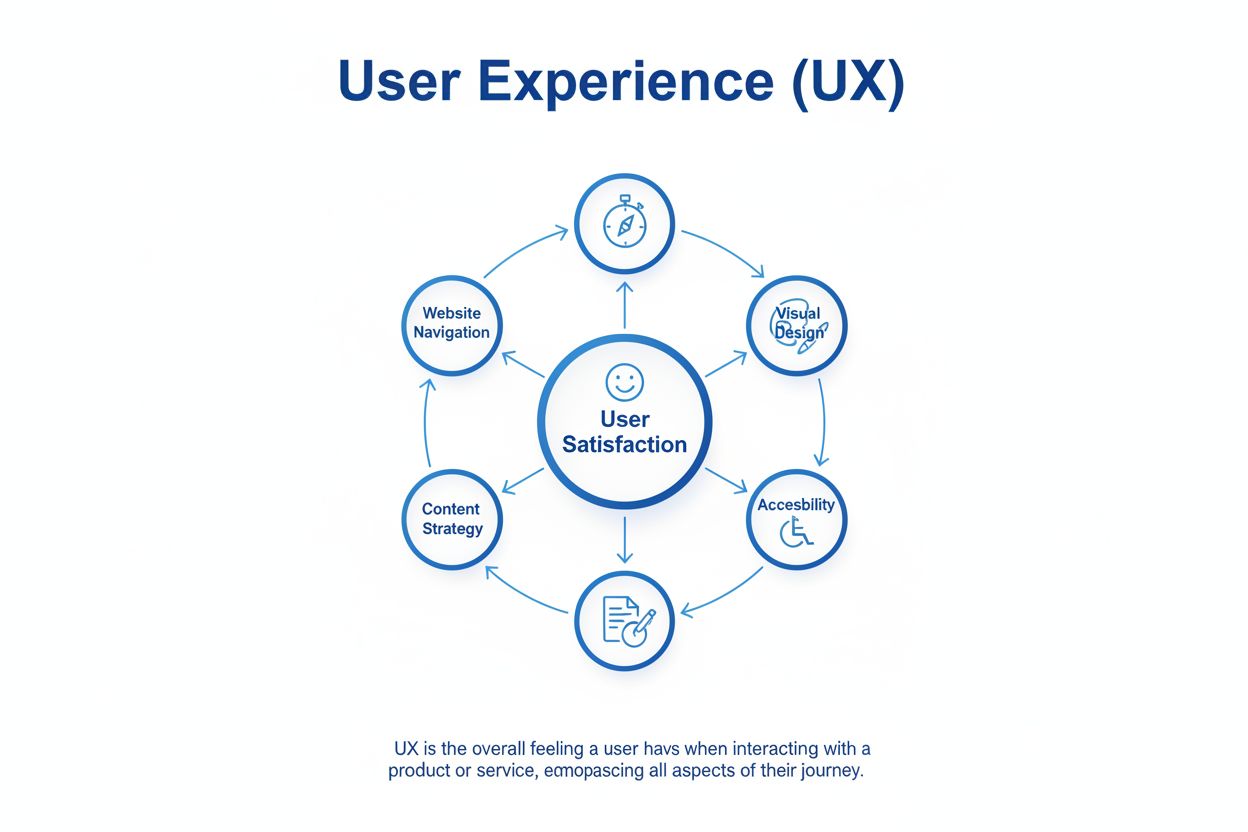
User Experience (UX) is the overall experience users have interacting with websites and products. Learn how UX impacts conversion rates, retention, and business...
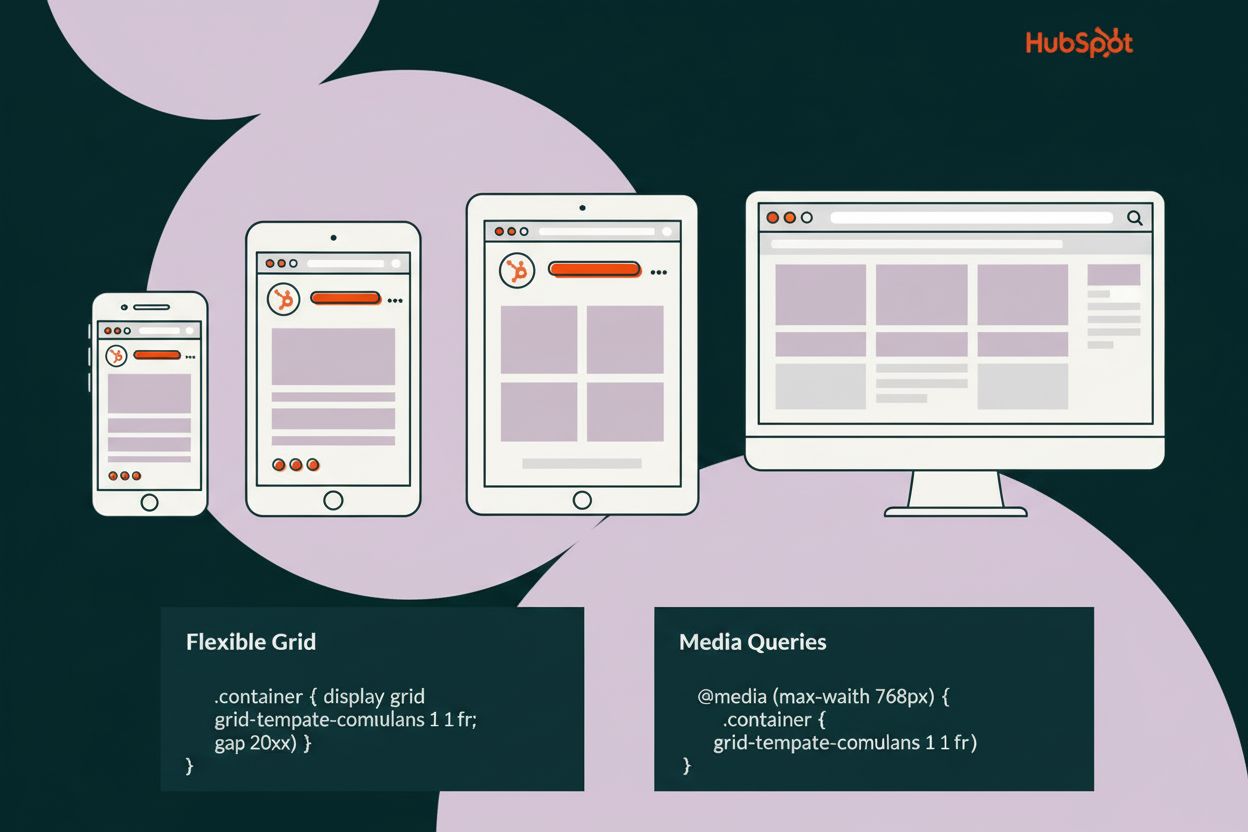
Responsive design automatically adapts websites to different screen sizes and devices. Learn how flexible layouts, media queries, and CSS techniques create seam...
Cookie Consent
We use cookies to enhance your browsing experience and analyze our traffic. See our privacy policy.