Data Visualization
Data visualization is the graphical representation of data using charts, graphs, and dashboards. Learn how visual data transforms complex information into actio...
13 min read

A chart is a visual data representation format that uses graphical elements such as bars, lines, points, or shapes to display quantitative or categorical information in a structured, easy-to-understand format. Charts condense large datasets into visual patterns that enable rapid comprehension, pattern recognition, and data-driven decision-making across business, scientific, and analytical contexts.
A chart is a visual data representation format that uses graphical elements such as bars, lines, points, or shapes to display quantitative or categorical information in a structured, easy-to-understand format. Charts condense large datasets into visual patterns that enable rapid comprehension, pattern recognition, and data-driven decision-making across business, scientific, and analytical contexts.
A chart is a visual data representation format that uses graphical elements—such as bars, lines, points, areas, or shapes—to display quantitative or categorical information in a structured, easily interpretable manner. Charts transform raw numerical data into visual patterns that enable rapid comprehension, pattern recognition, and insight extraction. Rather than requiring viewers to parse tables of numbers, charts leverage the human brain’s natural ability to process visual information quickly, making them indispensable tools in business intelligence, scientific research, journalism, and data-driven decision-making. The fundamental purpose of a chart is to communicate data stories clearly, accurately, and efficiently to diverse audiences, from technical analysts to executive stakeholders.
The concept of using visual representations to communicate data dates back centuries, with early examples including Florence Nightingale’s famous rose diagrams in the 1850s, which revolutionized how statistical information was presented to policymakers. However, the modern era of chart development accelerated dramatically with the advent of computers and digital technologies. In the 1980s and 1990s, software tools like Excel and Tableau democratized chart creation, moving visualization from specialized statisticians to everyday business users. Today, charts have evolved beyond static images to include interactive, real-time, and AI-augmented visualizations. According to recent industry data, approximately 85% of organizations now rely on visual data representations as a primary method for communicating insights, reflecting the critical role charts play in contemporary analytics ecosystems.
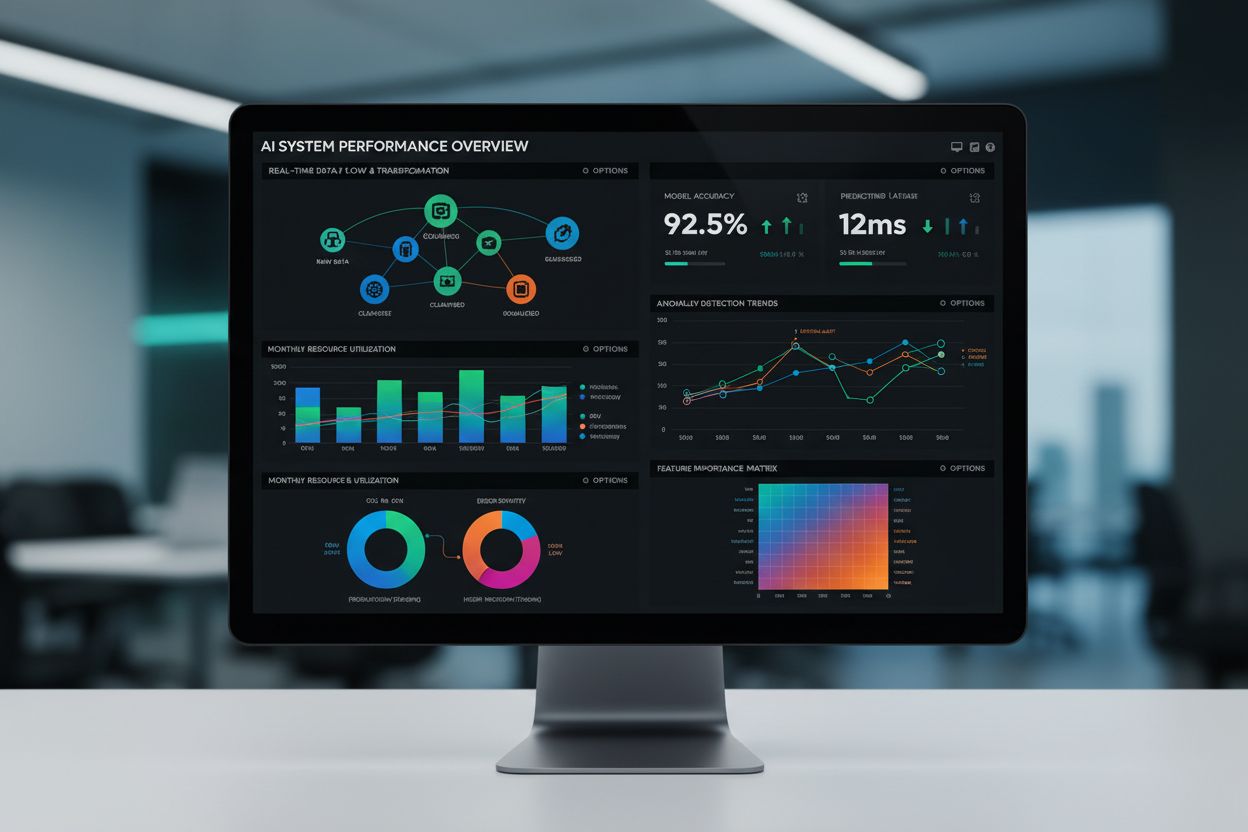
Charts serve multiple critical functions in modern data ecosystems. Comparative analysis is one of the most common uses, where bar charts and column charts allow viewers to compare values across categories or time periods. Trend identification relies heavily on line charts and area charts, which reveal how metrics change over time and help predict future patterns. Correlation and relationship analysis utilizes scatter plots and bubble charts to expose connections between variables. Distribution analysis employs histograms and density plots to understand how data is spread across a range. Hierarchical and compositional analysis uses treemaps, sunburst charts, and pie charts to show how parts contribute to a whole. In the context of AI monitoring platforms like AmICited, charts are essential for visualizing citation frequency, tracking domain visibility across AI systems like ChatGPT and Perplexity, and monitoring competitive positioning in AI-generated content ecosystems.
| Chart Type | Primary Use Case | Data Structure | Best For | Limitations |
|---|---|---|---|---|
| Bar Chart | Comparing categorical values | Categorical + Numeric | Ranking items, frequency distribution | Not ideal for time series with many data points |
| Line Chart | Tracking trends over time | Time + Numeric | Trend analysis, forecasting | Can obscure individual data points in dense datasets |
| Pie Chart | Showing proportional relationships | Categorical + Percentage | Part-to-whole relationships | Difficult to compare similar-sized slices accurately |
| Scatter Plot | Revealing correlations | Numeric + Numeric | Identifying relationships, outliers | Overlapping points can obscure density patterns |
| Heatmap | Displaying density and patterns | Categorical + Categorical + Numeric | Pattern recognition, correlation matrices | Requires color interpretation; less precise than other formats |
| Histogram | Analyzing distributions | Numeric ranges | Understanding data spread, identifying outliers | Bin size selection can affect interpretation |
| Funnel Chart | Tracking process stages | Sequential + Numeric | Conversion analysis, pipeline visualization | Difficult to compare exact values across stages |
| Treemap | Showing hierarchical data | Hierarchical + Numeric | Space-efficient visualization of nested categories | Area judgment less accurate than length comparison |
Charts work by mapping data dimensions to visual properties through a process called visual encoding. In a bar chart, for example, categorical variables are mapped to the horizontal axis, while numeric values are encoded as bar length on the vertical axis. The human visual system processes these encodings rapidly, allowing viewers to extract insights within milliseconds. Different chart types employ different encoding strategies: line charts use position and connection to show continuity, color-coded heatmaps use color intensity to represent magnitude, and bubble charts use size as an additional dimension. The effectiveness of a chart depends on how well the visual encoding matches the data structure and the analytical question being asked. Research in cognitive psychology demonstrates that position-based encodings (like bar length) are processed more accurately than area-based encodings (like bubble size), which is why bar charts often outperform pie charts for precise comparisons.
The business value of effective charting is substantial and measurable. Organizations that implement strong data visualization practices report 23% higher profitability and 41% faster decision-making compared to those relying on raw data tables. Charts reduce the time required for stakeholders to understand complex datasets from hours to minutes, enabling faster strategic responses to market changes. In competitive intelligence and brand monitoring contexts, charts are critical for visualizing market position, tracking competitor activity, and monitoring brand mentions across digital channels. For platforms like AmICited that track brand appearances in AI-generated responses, charts provide visual evidence of citation trends, competitive visibility, and the impact of content strategies on AI system outputs. The ability to present data visually also enhances stakeholder buy-in, as visual evidence is more persuasive than numerical claims alone—a phenomenon known as the “visual persuasion effect.”
In the context of AI monitoring platforms, charts serve specialized functions for tracking how brands, domains, and URLs appear across different AI systems. Citation frequency charts visualize how often a domain is mentioned in AI-generated responses from ChatGPT, Perplexity, Google AI Overviews, and Claude. Trend charts reveal whether citation frequency is increasing or decreasing over time, helping organizations understand the impact of content and SEO strategies on AI visibility. Comparative charts show how a brand’s visibility compares to competitors within the same industry or niche. Distribution charts illustrate which AI platforms mention a domain most frequently, enabling organizations to optimize their presence across different systems. Heatmaps can display citation patterns across different content categories, topics, or query types, revealing which areas of expertise are most visible in AI responses. These specialized applications demonstrate how chart selection must be tailored to specific analytical contexts and platform requirements.
Creating effective charts requires adherence to established best practices that enhance clarity and comprehension. Clarity is paramount: every element of a chart should serve a purpose, and unnecessary decorative elements should be removed. Accuracy demands that data be represented truthfully without distortion—axes must start at zero for bar charts, and scaling must be consistent. Simplicity means limiting the number of data series, using intuitive color schemes, and avoiding 3D effects that can distort perception. Context requires clear labeling of axes, inclusion of units, specification of data sources, and provision of relevant benchmarks or comparisons. Color selection is critical: approximately 8% of males and 0.5% of females have color blindness, so charts should use colorblind-friendly palettes. Typography matters as well—font sizes should be legible at the intended viewing distance, and contrast ratios should meet accessibility standards. Interactive charts should include tooltips, drill-down capabilities, and filtering options to enable deeper exploration without overwhelming the initial view.
The landscape of data visualization is evolving rapidly, driven by advances in artificial intelligence, interactive technologies, and real-time data processing. AI-powered chart recommendations are emerging, where machine learning algorithms analyze data structure and suggest optimal chart types automatically. Real-time and streaming charts update dynamically as new data arrives, enabling live monitoring of KPIs and operational metrics. Interactive and exploratory charts with drill-down, filtering, and cross-filtering capabilities are becoming standard, moving beyond static visualizations to dynamic analytical tools. Augmented reality and 3D visualizations are expanding the possibilities for representing complex, multidimensional datasets in immersive environments. Natural language generation is being integrated with charts to automatically generate textual summaries and insights, making data more accessible to non-technical audiences. Accessibility improvements are prioritizing colorblind-friendly palettes, screen reader compatibility, and alternative text descriptions. In the context of AI monitoring, future chart technologies will likely include predictive visualizations that forecast citation trends, sentiment analysis charts that visualize how brands are discussed in AI responses, and cross-platform comparison dashboards that aggregate visibility metrics across multiple AI systems simultaneously. As AI systems become more sophisticated and prevalent, the ability to visualize and monitor brand presence in AI-generated content will become increasingly critical for competitive positioning and brand management.
Charts serve as visual communication tools that transform raw numerical data into graphical representations, enabling stakeholders to quickly identify trends, patterns, and outliers. According to research in data visualization, charts improve comprehension speed by up to 40% compared to raw data tables, making them essential for business intelligence, reporting, and decision-making processes. Charts also reduce cognitive load by presenting complex datasets in digestible visual formats that the human brain processes more efficiently than text or numbers.
Different chart types are optimized for specific data relationships and analytical questions. Bar charts excel at comparing categorical values, line charts reveal trends over time, scatter plots expose correlations between variables, and pie charts show proportional relationships. The choice of chart type depends on the data structure, the audience's analytical needs, and the specific insight being communicated. Using the wrong chart type can obscure patterns or mislead viewers, which is why understanding chart selection is critical for effective data storytelling.
In AI monitoring platforms like AmICited, charts are fundamental for visualizing how brands, domains, and URLs appear across AI-generated responses from systems like ChatGPT, Perplexity, and Google AI Overviews. Charts enable users to track citation frequency, monitor competitive positioning, and analyze trends in AI-generated content mentions over time. Time-series charts, comparison charts, and distribution charts help organizations understand their visibility and impact within AI-driven search and response ecosystems.
Effective charts share several characteristics: clarity (the message is immediately apparent), accuracy (data is represented truthfully without distortion), simplicity (unnecessary elements are removed), and context (axes are labeled, units are specified, and sources are cited). Research shows that charts with consistent color schemes, appropriate scaling, and minimal visual clutter achieve 60% higher comprehension rates. Additionally, effective charts match the visualization type to the data structure and audience expertise level, ensuring the intended insight is communicated without confusion.
Modern chart technologies have expanded beyond static visualizations to include interactive, real-time, and AI-augmented formats. Interactive charts allow users to filter, drill-down, and explore data dynamically, while real-time charts update automatically as new data arrives. AI technologies now enable automated chart recommendations based on data structure, natural language generation of chart insights, and predictive visualizations that forecast future trends. These advancements have made charts more accessible to non-technical users while enabling deeper analytical capabilities for data professionals.
Chart design directly impacts how quickly and accurately viewers understand data. Elements such as color choice, font size, axis labeling, and visual hierarchy influence comprehension speed and accuracy. Studies indicate that well-designed charts reduce interpretation time by 30-50% compared to poorly designed ones. Color psychology, contrast ratios, and accessibility considerations (such as colorblind-friendly palettes) are critical design factors. Professional chart design also considers the medium (print vs. digital), audience demographics, and cultural context to ensure universal comprehension.
Charts accelerate decision-making by presenting data in formats that enable rapid pattern recognition and insight extraction. Executives and analysts can identify performance gaps, market opportunities, and risk factors within seconds of viewing a well-designed chart. Over 78% of enterprises report that visual data representations improve decision velocity and confidence. Charts also facilitate communication across teams by providing a common visual language, reducing misinterpretation and enabling data-driven consensus in strategic planning, performance management, and operational optimization.
Start tracking how AI chatbots mention your brand across ChatGPT, Perplexity, and other platforms. Get actionable insights to improve your AI presence.
Data visualization is the graphical representation of data using charts, graphs, and dashboards. Learn how visual data transforms complex information into actio...
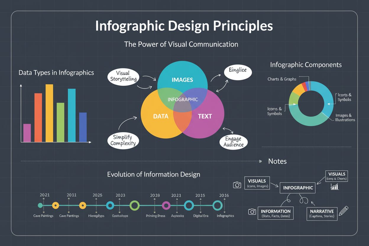
Infographic definition: visual representation combining images, charts, and text to present data clearly. Learn types, design principles, and business impact fo...
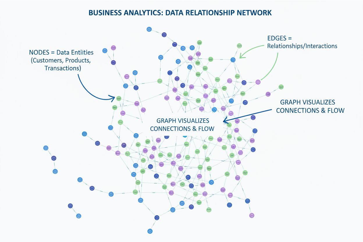
Learn what a graph is in data visualization. Discover how graphs display relationships between data using nodes and edges, and why they're essential for underst...
Cookie Consent
We use cookies to enhance your browsing experience and analyze our traffic. See our privacy policy.