
Chart
Learn what charts are, their types, and how they transform raw data into actionable insights. Essential guide to data visualization formats for analytics and re...
8 min read
Data visualization is the graphical representation of data using visual elements such as charts, graphs, maps, and dashboards to transform complex datasets into easily understandable insights. It enables organizations to identify patterns, trends, and relationships within large volumes of information, facilitating faster and more informed decision-making across all business functions.
Data visualization is the graphical representation of data using visual elements such as charts, graphs, maps, and dashboards to transform complex datasets into easily understandable insights. It enables organizations to identify patterns, trends, and relationships within large volumes of information, facilitating faster and more informed decision-making across all business functions.
Data visualization is the graphical representation of data using visual elements such as charts, graphs, maps, dashboards, and infographics to transform complex datasets into easily understandable insights. At its core, data visualization bridges the gap between raw numerical information and human comprehension by leveraging the brain’s natural ability to process visual information faster than text. The primary purpose of data visualization is to enable organizations, analysts, and decision-makers to quickly identify patterns, trends, correlations, and anomalies within large volumes of data that would otherwise remain hidden in spreadsheets or databases. In today’s data-driven world, where organizations generate over 328.77 million terabytes of data daily, the ability to visualize this information effectively has become not just beneficial but essential for competitive advantage and informed decision-making.
The practice of representing data visually dates back centuries, with early examples including thematic cartography and statistical graphics used by explorers and scientists to communicate geographical and quantitative information. However, the modern era of data visualization emerged during the 20th century as statistical thinking advanced and data collection expanded in the context of commerce and planning. The evolution accelerated dramatically with the advent of computing technology, which enabled the creation of increasingly sophisticated and interactive visualizations. Today, data visualization has become a cornerstone of business intelligence, data science, and analytics, with organizations recognizing that visual representations of data are significantly more effective for communication than traditional reports. Research from the University of Minnesota demonstrates that the human brain processes visual information 60,000 times faster than textual information, making data visualization a critical tool for organizations managing massive datasets. Furthermore, studies show that 90% of information transmitted to the brain is visual, and the brain can identify images in as little as 13 milliseconds, underscoring the neurological basis for visualization’s effectiveness in data interpretation and decision-making.
Understanding how the human brain processes visual information is fundamental to appreciating why data visualization is so powerful. Research from MIT and neuroscience studies reveal that 50% of the human brain’s cortex is dedicated to visual processing, making vision the dominant sense for information intake. When data is presented visually, it activates multiple cognitive pathways simultaneously, enabling faster comprehension and better retention. Studies show that people retain 65% of information three days after viewing an image with data, compared to only 10% of information they hear verbally. This dramatic difference in retention rates explains why organizations that implement data visualization tools report significantly improved decision-making capabilities. Additionally, the principle of visual encoding—the process of mapping data attributes to visual properties like color, size, position, and shape—allows viewers to instantly grasp complex relationships that would take minutes to understand through numerical tables. The effectiveness of visual encoding is so pronounced that when a scientific claim is presented with a simple graph, 97% of people believe the information is accurate, compared to only 68% when the same claim is presented in words or numbers alone.
| Aspect | Static Visualizations | Interactive Dashboards | Real-Time Monitoring | AI-Powered Visualization |
|---|---|---|---|---|
| Definition | Fixed charts and graphs that don’t change based on user interaction | Dynamic visual interfaces allowing users to filter, drill-down, and explore data | Live-updating visualizations reflecting data changes as they occur | Automated visualization generation using machine learning algorithms |
| Best For | Reports, presentations, historical analysis | Exploratory data analysis, self-service analytics | Operational monitoring, incident detection, brand tracking | Pattern discovery, anomaly detection, predictive insights |
| User Engagement | Passive consumption | Active exploration and discovery | Continuous monitoring and alerts | Guided insights and recommendations |
| Tools | Excel, Google Sheets, Tableau Public | Tableau, Power BI, Looker | Grafana, Kibana, Datadog | IBM Watson, Alteryx, Sisense |
| Implementation Time | Hours to days | Days to weeks | Weeks to months | Weeks to months |
| Cost | Low to moderate | Moderate to high | High | High |
| Scalability | Limited for large datasets | Excellent for enterprise data | Excellent for continuous streams | Excellent with cloud infrastructure |
| Customization | Limited | Highly customizable | Highly customizable | Moderate to high |
The technical implementation of data visualization involves several critical components working in concert to transform raw data into meaningful graphics. First, data collection and preparation ensures that information is accurate, complete, and standardized before visualization. This stage is crucial because poor data quality directly compromises the integrity of any visualization, potentially leading to misleading conclusions. Second, data analysis identifies the key metrics, dimensions, and relationships that warrant visual representation. Third, visual encoding maps data attributes to visual properties—for example, mapping sales figures to bar heights or time periods to positions along an x-axis. Fourth, interaction design enables users to explore visualizations through filtering, zooming, and drilling down into specific data segments. Finally, rendering and delivery ensures that visualizations are displayed correctly across different devices and platforms. Modern data visualization platforms leverage cloud computing, APIs, and real-time data streaming to enable organizations to visualize data as it’s generated, rather than relying on static snapshots. For platforms like AmICited that monitor brand mentions across AI systems, this technical infrastructure is essential for tracking how frequently and in what context a domain appears in AI-generated responses from ChatGPT, Perplexity, Google AI Overviews, and Claude.
The business value of data visualization extends far beyond aesthetic appeal; it directly impacts organizational performance and competitive positioning. Research from Bain & Company reveals that companies with the most advanced analytics capabilities—which heavily rely on data visualization—are 5 times more likely to make decisions faster than market peers and 3 times more likely to execute those decisions successfully. Additionally, these companies are 2 times more likely to be in the top quartile of financial performance within their industries. The Wharton School of Business conducted a landmark study demonstrating that while only 50% of an audience was convinced by a purely verbal presentation, that number jumped to over two-thirds when visual presentations were added. Furthermore, the same study found that organizations using data visualization could shorten business meetings by 24%, directly reducing operational costs and improving efficiency. According to Nucleus Research, analytics investments—particularly those incorporating strong visualization capabilities—deliver an average return of $9.01 per dollar spent, making data visualization one of the highest-ROI investments organizations can make. For enterprises managing complex data environments, the ability to quickly identify trends, spot anomalies, and communicate insights through visualization translates directly into faster time-to-market, better risk management, and improved stakeholder alignment.
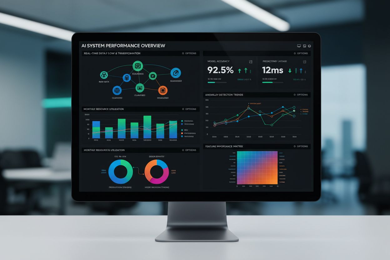
In the context of AI monitoring and brand tracking, data visualization plays a specialized but critical role in helping organizations understand their presence within AI-generated content. Platforms like AmICited leverage data visualization to display how frequently a brand or domain is cited across different AI systems, the context in which citations occur, and trends over time. Interactive dashboards can show metrics such as citation frequency, sentiment analysis of mentions, competitive positioning relative to other brands, and the distribution of citations across different AI platforms. Real-time visualization enables organizations to detect sudden changes in citation patterns—whether positive spikes indicating increased AI adoption of their content or negative trends suggesting declining visibility. Heatmaps can reveal which specific topics or content types generate the most AI citations, while trend lines show whether citation momentum is accelerating or declining. Geographic visualizations can display where AI-generated content mentioning a brand is being consumed, and temporal visualizations can identify peak citation periods. This specialized application of data visualization transforms raw tracking data into strategic intelligence that helps organizations optimize their content strategy, identify emerging opportunities, and respond quickly to competitive threats in the AI-driven information landscape.
Different types of data visualizations serve distinct purposes and are optimized for specific data types and analytical questions. Bar charts excel at comparing categorical data across multiple dimensions, making them ideal for displaying citation frequency across different AI platforms or comparing brand mentions against competitors. Line graphs effectively show trends over time, perfect for tracking how a brand’s AI citation volume changes week-over-week or month-over-month. Pie charts represent proportions of a whole, useful for showing the distribution of citations across different content categories or AI systems. Scatter plots reveal relationships between two variables, such as the correlation between content length and citation frequency. Heatmaps use color intensity to represent data density and correlations, making them excellent for identifying patterns in large datasets or showing which topics generate the most AI citations. Geographical maps display spatial data, enabling organizations to see where their AI-cited content is being consumed globally. Dashboards combine multiple visualization types into a unified interface, providing comprehensive overviews of key performance indicators and enabling stakeholders to monitor multiple metrics simultaneously. Bubble charts can represent three variables at once, useful for analyzing citation volume, sentiment, and recency together. Waterfall charts show cumulative impact of sequential data points, helpful for understanding how different factors contribute to overall citation metrics. The selection of appropriate visualization types depends on the specific analytical question, the nature of the data, and the intended audience’s level of technical sophistication.
Creating impactful data visualizations requires adherence to established best practices that ensure clarity, accuracy, and engagement. First, know your audience and tailor visualizations to their expertise level, needs, and decision-making context. Non-technical stakeholders require simpler, more intuitive visualizations, while data analysts may appreciate more complex representations. Second, choose the right visualization type based on your data characteristics and analytical objectives—using a pie chart to show trends over time, for example, would be ineffective. Third, keep it simple by eliminating unnecessary elements, reducing visual clutter, and focusing on the most important insights. Research shows that people spend 39% less time finding crucial information in documents with visuals, colors, and charts compared to text-only documents. Fourth, use colors strategically to enhance readability and highlight important data points, while avoiding color schemes that may be difficult for colorblind viewers to distinguish. Fifth, provide context with clear labels, titles, legends, and axis descriptions so viewers can understand what they’re seeing without requiring external explanation. Sixth, maintain data accuracy by ensuring that visual representations faithfully reflect underlying data without distortion, misleading scales, or selective presentation. Seventh, enable interactivity where appropriate, allowing users to explore data, filter by specific criteria, and drill down into details for deeper analysis. Eighth, test your visualizations with representative users to ensure they communicate the intended message and don’t introduce unintended biases or misinterpretations.
Despite its numerous advantages, data visualization faces several significant challenges that organizations must navigate carefully. Data quality issues represent the most fundamental challenge—if underlying data is inaccurate, incomplete, or biased, visualizations will perpetuate these problems and potentially lead to flawed decisions. Misleading representations occur when visualization designers, intentionally or unintentionally, distort data through inappropriate scale choices, selective data presentation, or visual tricks that exaggerate certain trends while minimizing others. Research shows that when data is presented in color, finding correct information takes 70% less time, but this same principle can be exploited to manipulate perception. Cognitive overload happens when visualizations attempt to display too much information simultaneously, overwhelming viewers and reducing comprehension. Design bias emerges from subjective choices about colors, chart types, and emphasis that subtly influence how audiences interpret data—for example, using bright colors to highlight small positive changes while using muted colors for significant negative trends. Scalability challenges arise when attempting to visualize extremely large datasets, which can slow performance and reduce interactivity. Accessibility concerns affect users with visual impairments or color blindness, requiring careful attention to contrast ratios, alternative text descriptions, and non-color-based encoding methods. Tool complexity means that creating sophisticated visualizations often requires specialized skills and training, limiting adoption among non-technical users. Real-time processing demands for continuously updated visualizations require robust data infrastructure and can strain system resources.
The landscape of data visualization is rapidly evolving, driven by advances in artificial intelligence, augmented reality, and cloud computing. AI-driven visualization represents one of the most significant emerging trends, with machine learning algorithms automatically identifying the most relevant visualizations for specific datasets and generating insights without human intervention. By 2026, AI-powered data visualization tools are projected to achieve a 45% adoption rate among enterprises. Augmented Reality (AR) and Virtual Reality (VR) integration is expected to grow by 35% by 2026, enabling immersive data exploration experiences where users can interact with three-dimensional visualizations in physical space. Real-time data streaming continues to advance, with real-time visualization tools predicted to grow in demand by 50% in the next three years, enabling organizations to monitor metrics as they change. 3D data visualization is expected to dominate over 2D visualization by a margin of 60% by 2027, providing richer representations of complex, multidimensional data. Mobile data visualization tools are anticipated to see a 40% growth rate by 2025, reflecting the increasing need for data insights on smartphones and tablets. Cloud-based visualization platforms are expected to grow by 38% by 2025, enabling scalable, accessible analytics without requiring on-premises infrastructure. Natural Language Processing (NLP) integration will enable users to interact with visualizations using voice commands and natural language queries, democratizing data exploration. The global data visualization market itself is projected to reach $10.2 billion by 2025, up from $7.6 billion in 2021, with 65% of businesses planning to increase their visualization budgets in the next two years. For organizations like those using AmICited for AI monitoring, these trends suggest increasingly sophisticated capabilities for tracking, analyzing, and visualizing brand presence across AI systems, enabling more granular insights into how AI systems cite and reference specific domains and content.
In an era where organizations generate more data daily than existed in entire decades just a few years ago, data visualization has transitioned from a nice-to-have capability to an absolute necessity for competitive survival. The convergence of neuroscience research confirming the brain’s preference for visual information, business studies demonstrating visualization’s impact on decision-making speed and accuracy, and technological advances enabling real-time, interactive visualizations has created an environment where organizations that master data visualization gain significant advantages over those that don’t. For platforms monitoring AI citations and brand presence, visualization transforms raw tracking data into strategic intelligence that drives content optimization, competitive positioning, and market responsiveness. As artificial intelligence, augmented reality, and cloud computing continue to advance, data visualization will become even more sophisticated, accessible, and integral to organizational success. The organizations that invest in data visualization capabilities today—whether through dedicated tools, skilled personnel, or integrated platforms—are positioning themselves to thrive in tomorrow’s data-driven landscape.
Data visualization is critical for AI monitoring platforms because it transforms raw tracking data into actionable insights that stakeholders can understand instantly. When monitoring brand mentions across AI systems like ChatGPT, Perplexity, and Google AI Overviews, visual dashboards enable teams to spot trends, anomalies, and opportunities in real-time. According to research, 70% of organizations believe data visualization contributes significantly to defining and adjusting business strategies, making it essential for tracking AI citation patterns and brand presence.
The human brain processes visual information 60,000 times faster than text, with 90% of information transmitted to the brain being visual. Research from MIT shows that the brain can identify images in just 13 milliseconds, while 50% of the brain's cortex is dedicated to visual processing. This neurological advantage explains why data visualizations are 30 times more likely to be read than plain text and why 65% of people are visual learners who retain information better through graphics.
Common data visualization types include bar charts for comparisons, line graphs for trends over time, pie charts for proportions, scatter plots for relationships, heatmaps for density patterns, and interactive dashboards for real-time monitoring. For AI monitoring platforms like AmICited, dashboards combining multiple visualization types are particularly valuable for tracking brand mentions across different AI systems, displaying KPIs, and identifying emerging patterns in how AI systems cite or reference specific domains.
Data visualization accelerates decision-making by reducing cognitive load and enabling rapid pattern recognition. Studies show that managers using visual data recovery tools are 28% more likely to find timely information than those relying on reports alone, and 48% can find needed data without IT support. Companies using advanced data visualization are 5 times more likely to make faster decisions and 3 times more likely to execute them successfully compared to competitors.
In AI citation monitoring, data visualization transforms complex tracking data into clear visual representations showing how often and where a brand appears in AI-generated responses. Interactive dashboards can display citation frequency across platforms, sentiment analysis, competitive positioning, and temporal trends. This visual approach helps organizations quickly identify whether their content is being cited by AI systems, understand citation patterns, and adjust their content strategy accordingly.
Effective data visualizations require accurate data representation, appropriate chart selection for the data type, consistent color schemes, clear labeling, and accessibility considerations. Organizations should avoid distorted scales, selective data presentation, and visual clutter that can mislead audiences. Best practices include knowing your audience, maintaining data accuracy, using colors strategically, and testing visualizations with end-users to ensure they communicate the intended message without bias or misinterpretation.
The global data visualization market is projected to reach $10.2 billion by 2025, up from $7.6 billion in 2021, representing a compound annual growth rate of approximately 10.2%. This growth reflects increasing enterprise adoption of visualization tools, with 68% of enterprises increasing their data visualization investments in the past two years. By 2027, 3D data visualization is expected to dominate over 2D visualization by a margin of 60%, indicating significant evolution in how organizations visualize complex data.
Start tracking how AI chatbots mention your brand across ChatGPT, Perplexity, and other platforms. Get actionable insights to improve your AI presence.
Learn what charts are, their types, and how they transform raw data into actionable insights. Essential guide to data visualization formats for analytics and re...
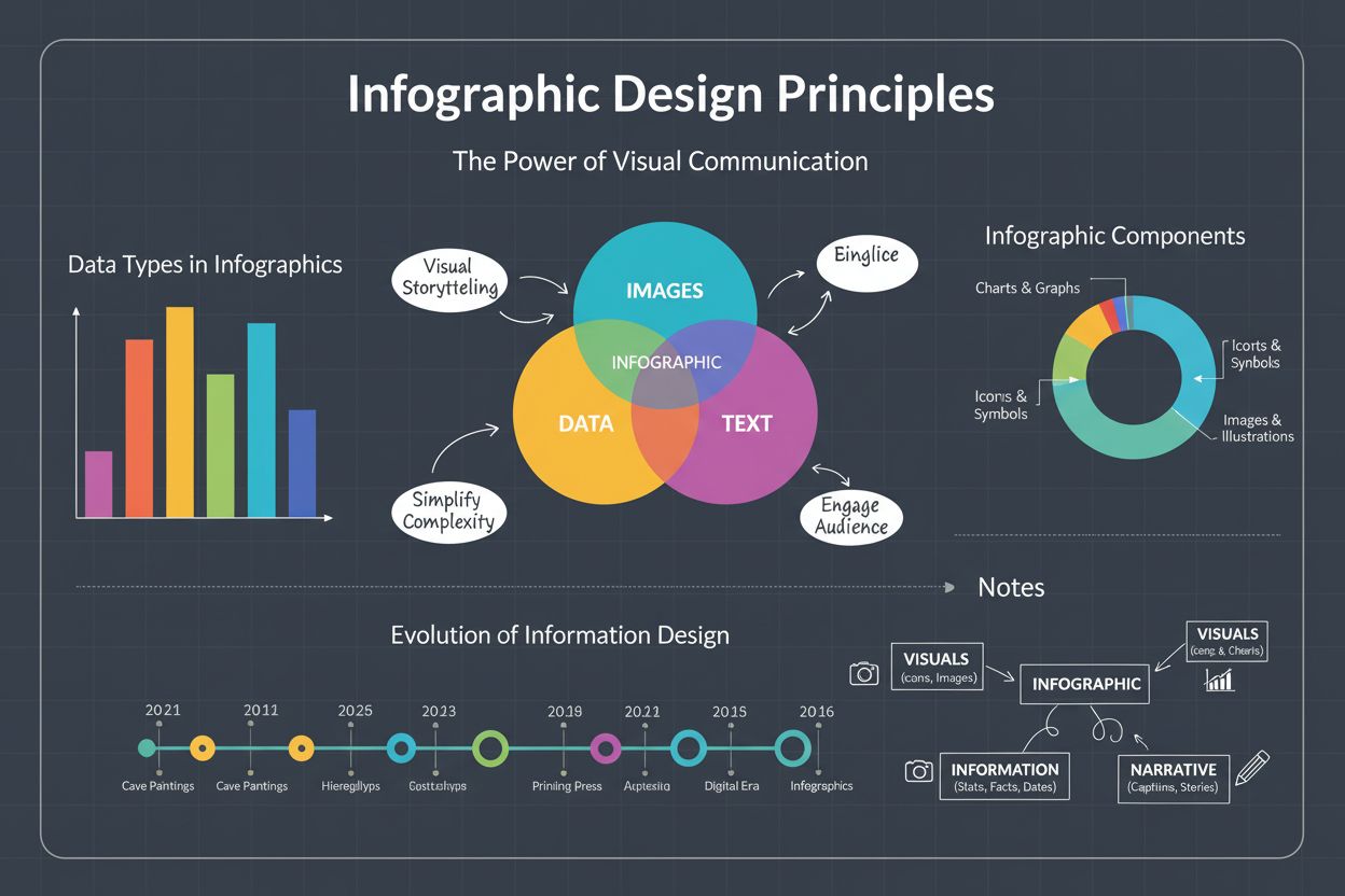
Infographic definition: visual representation combining images, charts, and text to present data clearly. Learn types, design principles, and business impact fo...
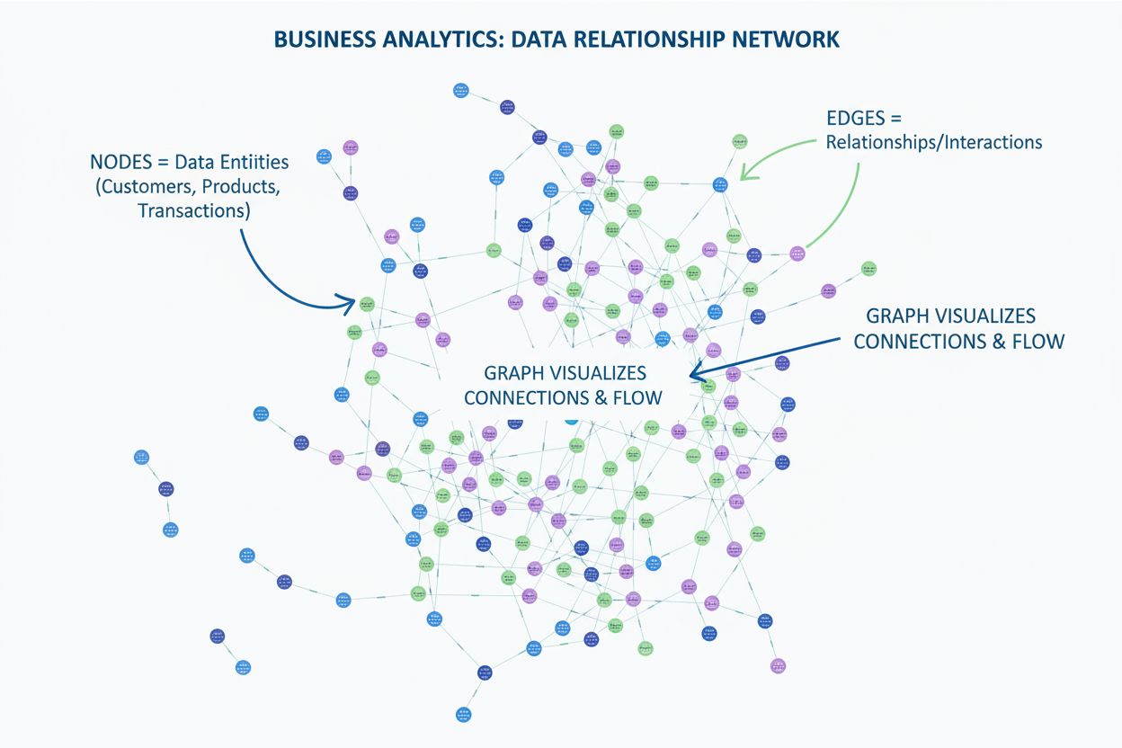
Learn what a graph is in data visualization. Discover how graphs display relationships between data using nodes and edges, and why they're essential for underst...
Cookie Consent
We use cookies to enhance your browsing experience and analyze our traffic. See our privacy policy.