Client-Side Rendering (CSR)
Află ce este Client-Side Rendering (CSR), cum funcționează, avantajele și dezavantajele sale, precum și impactul asupra SEO, indexării AI și performanței aplica...
14 min citire
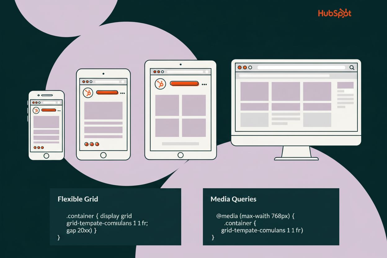
Designul responsiv este o abordare a designului web care ajustează automat aspectul, conținutul și funcționalitatea site-urilor pentru a se potrivi oricărei dimensiuni de ecran sau dispozitiv, de la telefoane mobile la monitoare desktop. Utilizează grile flexibile, imagini fluide și interogări media CSS pentru a asigura o experiență optimă utilizatorului pe toate dispozitivele, fără a necesita versiuni separate ale unui site.
Designul responsiv este o abordare a designului web care ajustează automat aspectul, conținutul și funcționalitatea site-urilor pentru a se potrivi oricărei dimensiuni de ecran sau dispozitiv, de la telefoane mobile la monitoare desktop. Utilizează grile flexibile, imagini fluide și interogări media CSS pentru a asigura o experiență optimă utilizatorului pe toate dispozitivele, fără a necesita versiuni separate ale unui site.
Responsive design is a web design approach that automatically adjusts website layouts, content, and functionality to fit any screen size or device, from mobile phones to desktop monitors. Rather than creating separate versions of a website for different devices, responsive design uses a single, flexible codebase that intelligently reorganizes and resizes elements based on the user’s device characteristics. This ensures that whether a user accesses your website from a smartphone with a 360-pixel width, a tablet with an 810-pixel width, or a desktop monitor with a 1920-pixel width, they receive an optimized, fully functional experience tailored to their specific screen dimensions. The term “responsive design” was coined by Ethan Marcotte in 2010 and has since become the industry standard for modern web development, fundamentally changing how developers approach cross-device compatibility.
The concept of responsive design emerged from the necessity to address the explosive growth of mobile device usage in the early 2010s. Before responsive design became mainstream, developers faced a critical challenge: websites designed for desktop monitors looked terrible on mobile devices, with text becoming unreadable, images overflowing, and navigation becoming impossible to use. Companies had two options—create separate mobile websites or accept poor mobile experiences. Ethan Marcotte’s groundbreaking article in A List Apart introduced the concept of combining fluid grids, flexible images, and media queries to create layouts that could adapt to any screen size. This innovation eliminated the need for multiple website versions and provided a scalable solution for the rapidly diversifying device landscape. Today, responsive design is not just a best practice—it’s a fundamental requirement, with 62.54% of global website traffic coming from mobile devices in 2025, according to Statista. The evolution from fixed-width layouts to fluid, responsive systems represents one of the most significant paradigm shifts in web development history.
Responsive design relies on three fundamental technical pillars: fluid grids, flexible images, and CSS media queries. Fluid grids replace fixed pixel-based layouts with proportional measurements using percentages or relative units like em and rem. Instead of setting a container to a fixed 960 pixels wide, a responsive grid might use width: 100% or width: calc(100% - 2rem), allowing the layout to scale proportionally with the viewport. Flexible images are implemented using CSS properties like max-width: 100% and height: auto, ensuring images scale down to fit their containers without exceeding their original dimensions or becoming pixelated. CSS media queries are conditional CSS rules that apply different styles based on device characteristics such as screen width, height, device orientation, or pixel density. The syntax @media screen and (max-width: 768px) { … } allows developers to define breakpoints where the layout changes to accommodate different screen sizes. Modern responsive design also leverages advanced CSS layout systems like Flexbox and CSS Grid, which are inherently responsive and provide more powerful tools for creating flexible layouts with minimal media queries. The viewport meta tag, , is essential for telling mobile browsers to render pages at the device’s actual width rather than assuming a desktop width.
| Aspect | Responsive Design | Adaptive Design |
|---|---|---|
| Layout Approach | Fluid, continuously adjusts to any screen size | Fixed layouts for specific predefined breakpoints |
| Codebase | Single codebase serves all devices | Multiple codebases for different device categories |
| Flexibility | Highly flexible, future-proof for new devices | Limited to predefined screen sizes |
| Development Cost | Lower cost, single version to maintain | Higher cost, multiple versions to develop and maintain |
| Performance | Optimized through progressive enhancement | Can be optimized for specific devices |
| Browser Detection | Not required, CSS-based adaptation | Often uses server-side device detection |
| Best For | New projects, long-term scalability | Existing sites being refreshed, specific device optimization |
| User Experience | Seamless across all devices | Tailored experience for specific devices |
| SEO Impact | Preferred by Google, mobile-first indexing friendly | Can create duplicate content issues |
| Implementation Time | Moderate, requires planning and testing | Longer, requires multiple design iterations |
Mobile-first design is a strategic approach within responsive design that prioritizes designing for the smallest screens first, then progressively enhancing the experience for larger screens. This methodology fundamentally changes the development workflow—instead of starting with a desktop layout and trying to squeeze it onto mobile screens, developers begin with a minimal, essential mobile experience and add complexity as screen space increases. The mobile-first approach offers several critical advantages: it forces designers to prioritize content and functionality, resulting in cleaner, more focused interfaces; it reduces CSS file size by avoiding unnecessary styles that must be overridden for mobile; and it naturally aligns with modern web performance best practices. With mobile devices accounting for 62.45% of global internet traffic, designing mobile-first ensures the majority of users receive an optimized experience from the start. This approach also improves SEO performance because Google’s mobile-first indexing means the search engine primarily evaluates the mobile version of websites. Developers using mobile-first design typically structure their CSS with base styles for mobile, then use media queries with min-width conditions to add styles for tablets and desktops: @media screen and (min-width: 768px) { … }.
Breakpoints are specific screen widths where the layout changes to accommodate different device sizes. Rather than designing for every possible screen resolution, developers identify key breakpoints where the design naturally breaks and needs adjustment. Common responsive design breakpoints include: 320-480px for small mobile phones, 481-768px for larger phones and small tablets, 769-1024px for tablets in landscape orientation, 1025-1200px for laptops and small desktops, and 1201px and above for large desktops and ultra-wide monitors. However, modern best practices emphasize setting breakpoints based on content needs rather than specific devices. According to HubSpot’s research, the most prevalent mobile viewport is 360 × 800 px (10.27% of global mobile usage), followed by 390 × 844 px (6.26%) and 393 × 873 px (5.23%). For tablets, 768 × 1024 px dominates with 15.18% usage, while 1920 × 1080 px remains the most common desktop resolution at 20.28%. Using relative units like em or rem for breakpoints instead of fixed pixels provides better accessibility and flexibility, as breakpoints scale with user font size preferences. The concept of “designing to the content” means adjusting breakpoints where the layout actually needs to change, rather than forcing content into predetermined device categories.
CSS media queries are the technical foundation enabling responsive design, allowing developers to apply conditional styling based on device characteristics. The basic syntax involves the @media rule followed by media type and feature queries: @media screen and (max-width: 768px) { .container { width: 100%; } }. Media queries can target various features including viewport width (width, min-width, max-width), viewport height, device orientation (portrait or landscape), pixel density (for retina displays), and even user preferences like prefers-reduced-motion for accessibility. Modern CSS supports logical operators—and, or, and not—enabling complex conditions: @media screen and (min-width: 768px) and (max-width: 1024px) { … }. Mobile-first media queries use min-width conditions, progressively adding styles as screens get larger, while desktop-first approaches use max-width conditions, removing styles for smaller screens. Best practices recommend using relative units for breakpoints (em or rem) rather than pixels, as they respect user font size settings and provide better accessibility. The CSS Grid and Flexbox layout systems have reduced the need for extensive media queries—these modern layout methods are inherently responsive and automatically adjust to available space. Developers can also use CSS custom properties (variables) to store breakpoint values, making maintenance easier: –mobile-breakpoint: 768px; then using calc() functions to create responsive values that scale smoothly across screen sizes.
Responsive images are critical for responsive design, as serving the same large desktop image to mobile users wastes bandwidth and slows page load times. The HTML <picture> element and <img> srcset and sizes attributes enable serving different images based on device characteristics. The picture element allows developers to specify multiple image sources with media queries: 
 . Fluid images use CSS properties like max-width: 100% and height: auto to scale images proportionally within their containers. Modern image formats like WebP provide better compression for web delivery, and developers should optimize images using tools like ImageOptim or TinyPNG before uploading. Responsive video implementation uses similar techniques—wrapping videos in containers with aspect-ratio CSS properties ensures they maintain proper proportions across screen sizes. The CSS aspect-ratio property (aspect-ratio: 16 / 9) is particularly useful for maintaining video and image proportions without requiring padding-bottom hacks.
Responsive typography ensures text remains readable and visually appropriate across all screen sizes. Rather than using fixed font sizes, responsive design employs relative units like em, rem, and viewport units (vw, vh). The rem unit (root em) is preferred for most typography, as it scales based on the root font size, typically 16px by default. Setting html { font-size: 16px; } and then using rem for all elements (h1 { font-size: 2rem; }) creates a scalable typography system. Viewport units (vw for viewport width) enable fonts to scale fluidly with screen size: h1 { font-size: 6vw; } makes the heading 6% of the viewport width. However, using only viewport units prevents users from zooming text, so the recommended approach combines fixed and fluid units: h1 { font-size: calc(1.5rem + 4vw); }. This formula ensures the heading has a minimum size (1.5rem) while also scaling with viewport width. Media queries adjust font sizes at specific breakpoints: @media (max-width: 768px) { h1 { font-size: 1.5rem; } } @media (min-width: 1200px) { h1 { font-size: 3rem; } }. Line height and letter spacing should also be responsive—longer lines on desktop screens benefit from increased line height (1.6-1.8), while mobile text typically uses tighter spacing (1.4-1.5). Responsive typography improves readability, reduces cognitive load, and enhances overall user experience across devices.
The business case for responsive design is compelling and data-driven. Google’s mobile-first indexing means the search engine primarily crawls and ranks the mobile version of websites, making responsive design essential for SEO performance. According to Google Search Central, responsive design eliminates common indexing problems, reduces duplicate content risks, and ensures all users access the same content at the same URL. With 62.54% of global website traffic coming from mobile devices in 2025, websites without responsive design are effectively excluding the majority of potential visitors. Studies consistently show that responsive websites have significantly lower bounce rates—users are more likely to stay on sites that display properly on their devices. E-commerce data reveals that over 75% of online sales are projected to come from mobile devices in 2025, making responsive design directly tied to revenue generation. Responsive design also reduces development and maintenance costs by eliminating the need for separate mobile and desktop versions. A single responsive codebase requires fewer resources to update, test, and deploy compared to maintaining multiple versions. Additionally, responsive design improves Core Web Vitals metrics—Google’s ranking factors that measure page experience—by enabling optimized performance across devices. Companies that invest in responsive design see improved user engagement, higher conversion rates, better search rankings, and reduced bounce rates, directly impacting business metrics and bottom-line profitability.
Successful responsive design implementation requires a systematic approach combining planning, coding discipline, and thorough testing. Start with a mobile-first approach, designing the smallest screen experience first, then progressively enhance for larger screens. Use semantic HTML to create meaningful document structure that works well with responsive CSS. Implement flexible layouts using Flexbox and CSS Grid rather than relying solely on media queries—these modern layout systems automatically adapt to available space. Set breakpoints based on content needs rather than specific devices, testing where the layout actually breaks. Use relative units (em, rem, %, vw) instead of fixed pixels for better scalability and accessibility. Optimize images and media using responsive image techniques, modern formats, and compression. Test extensively across real devices and browsers, not just browser developer tools—use platforms like BrowserStack or LambdaTest to test on actual devices. Implement performance monitoring to ensure responsive designs load quickly on mobile networks. Use CSS custom properties (variables) to manage breakpoints and values consistently. Validate that touch targets are appropriately sized (minimum 44x44 pixels) for mobile users. Test keyboard navigation and screen reader compatibility to ensure accessibility across devices. Monitor Core Web Vitals metrics (Largest Contentful Paint, First Input Delay, Cumulative Layout Shift) to ensure responsive designs meet Google’s performance standards.
The future of responsive design continues to evolve with advancing web technologies and changing user behaviors. Container queries represent a significant advancement, allowing styles to adapt based on the size of a component’s container rather than the viewport—this enables truly modular, reusable components that work in any context. CSS subgrid provides more powerful grid layout capabilities, enabling nested grids to align with parent grids for more sophisticated responsive layouts. Aspect ratio CSS property simplifies maintaining proper proportions for images and videos without requiring padding-bottom hacks. Dynamic viewport units (dvh, dvw, lvh, lvw, svh, svw) address mobile browser UI challenges where viewport height changes as browser chrome appears and disappears. Responsive design systems are becoming increasingly sophisticated, with design tokens and component libraries enabling consistent responsive experiences across entire organizations. AI-driven responsive design tools are emerging to automatically generate responsive layouts and suggest optimal breakpoints based on content analysis. The integration of progressive web apps (PWAs) with responsive design creates app-like experiences that work seamlessly across devices. Voice interfaces and smart speakers are expanding the definition of responsive design beyond visual screens to include audio and conversational interfaces. As 5G networks become more prevalent, responsive design will increasingly focus on optimizing for high-bandwidth experiences while maintaining fallbacks for slower connections. The convergence of responsive design with accessibility standards (WCAG 2.1 and beyond) ensures that responsive websites are not just visually adaptive but also inclusive for users with disabilities. The future emphasizes performance-first responsive design, where optimization for speed and efficiency is built into the responsive design process from the beginning rather than added as an afterthought.
Designul responsiv este esențial pentru SEO deoarece Google folosește indexarea mobile-first, ceea ce înseamnă că indexează și clasează în principal versiunea mobilă a site-urilor. Potrivit Google Search Central, designul responsiv elimină problemele de conținut duplicat, îmbunătățește crawlabilitatea și asigură accesul tuturor utilizatorilor la același conținut pe aceeași adresă URL. Având în vedere că dispozitivele mobile au reprezentat 62,54% din traficul global de internet în 2025, designul responsiv influențează direct clasamentul și vizibilitatea în căutări.
Designul responsiv folosește layout-uri fluide care se ajustează automat la orice dimensiune de ecran folosind interogări media CSS și unități flexibile, în timp ce designul adaptiv creează layout-uri fixe pentru dimensiuni de ecran predefinite. Designul responsiv necesită o singură bază de cod și este mai rentabil, în timp ce designul adaptiv necesită baze de cod multiple pentru diferite dispozitive. Designul responsiv este, în general, preferat pentru proiectele noi datorită flexibilității și caracterului său pregătit pentru viitor.
Breakpoint-urile obișnuite pentru designul responsiv includ: 480px pentru telefoane mobile mici, 768px pentru tablete, 1024px pentru desktop-uri mici și 1280px+ pentru desktop-uri mari. Totuși, cele mai bune practici moderne recomandă stabilirea breakpoint-urilor acolo unde designul „se rupe” natural, nu folosind valori fixe pentru dispozitive. Utilizarea unităților relative precum em sau rem pentru breakpoint-uri este preferată în locul valorilor absolute în pixeli, pentru o mai bună accesibilitate și flexibilitate.
Interogările media sunt reguli CSS care aplică stiluri diferite în funcție de caracteristicile dispozitivului, cum ar fi lățimea ecranului, înălțimea sau orientarea. Sintaxa folosește @media urmat de condiții, de exemplu @media screen and (max-width: 768px). Când condiția este adevărată, regulile CSS din interiorul blocului de interogare media se aplică. Interogările media permit dezvoltatorilor să creeze layout-uri diferite pentru diverse dimensiuni de ecran fără a schimba structura HTML.
Designul mobile-first înseamnă începerea cu stiluri pentru cele mai mici ecrane (dispozitive mobile) și adăugarea progresivă de complexitate pentru ecrane mai mari folosind interogări media. Această abordare asigură că informațiile esențiale funcționează pe toate dispozitivele, reduce dimensiunea fișierului CSS și îmbunătățește performanța. Obligă designerii să prioritizeze informațiile și funcționalitățile critice, rezultând experiențe mai bune pentru utilizatori pe toate dispozitivele.
Grilele flexibile folosesc unități relative precum procente în locul pixelilor fixați, permițând layout-ului să se scaleze proporțional cu dimensiunea ecranului. Imaginile fluide sunt setate cu max-width: 100% pentru a se micșora în interiorul containerelor lor fără a depăși dimensiunea intrinsecă. Împreună, aceste tehnici asigură ca toate elementele paginii să se adapteze lin la diferite lățimi ale ecranului, menținând proporțiile și lizibilitatea pe orice dispozitiv.
Framework-uri populare pentru design responsiv includ Bootstrap, Foundation, Tailwind CSS și W3.CSS, care oferă componente responsive și sisteme de grilă predefinite. Funcționalitățile CSS moderne precum Flexbox și CSS Grid sunt în mod inerent responsive și reduc nevoia de framework-uri. Instrumentele pentru dezvoltatori din browsere, platforme de testare precum BrowserStack și instrumentele de testare pe dispozitive virtuale ajută dezvoltatorii să testeze designul responsiv pe mai multe dimensiuni de ecran și dispozitive.
Designul responsiv îmbunătățește performanța prin optimizarea imaginilor și conținutului pentru dispozitive specifice, reducând descărcările inutile pe mobil. Îmbunătățește experiența utilizatorului prin eliminarea nevoii de zoom, scroll orizontal sau ajustări. Studiile arată că site-urile responsive au rate de respingere mai mici, implicare mai mare și rate de conversie mai bune. Având în vedere că 62,54% din trafic provine de pe dispozitive mobile, designul responsiv influențează direct indicatorii de afaceri și satisfacția utilizatorului.
Începe să urmărești cum te menționează chatbot-urile AI pe ChatGPT, Perplexity și alte platforme. Obține informații utile pentru a-ți îmbunătăți prezența în AI.
Află ce este Client-Side Rendering (CSR), cum funcționează, avantajele și dezavantajele sale, precum și impactul asupra SEO, indexării AI și performanței aplica...
Redarea dinamică servește HTML static boților motoarelor de căutare, livrând în același timp conținut randat pe partea clientului utilizatorilor. Află cum aceas...

Află cum redarea dinamică influențează vizibilitatea crawlerilor AI, ChatGPT, Perplexity și Claude. Descoperă de ce sistemele AI nu pot reda JavaScript și cum s...
Consimțământ Cookie
Folosim cookie-uri pentru a vă îmbunătăți experiența de navigare și a analiza traficul nostru. See our privacy policy.