


SEO Quadrant Demand and Rank
Quadrant — the quadrant report — plots every tracked keyword or page by organic demand on one axis and average position on the other, using your connected Google Search Console and Bing Webmaster Tools data. High demand paired with a weak position is the gap worth closing; the same demand paired with a strong position is worth defending.
High-Demand Ranking Opportunities
There is no shaded box or dividing line drawn on the chart — you read the same four zones by eye. Right and low is the quick wins SEO corner, and it’s the most actionable: real demand, worse rank, clear headroom. Right and top already converts; defend it, since even a small slip there risks clicks that are already landing. Left and top ranks well on limited demand, and left and low is usually the lowest priority of the four.
- Demand vs position, plotted — every tracked keyword or page placed by impressions on one axis and impressions-weighted average position on the other.
- Read as four zones, not four boxes — the chart itself is a plain scatter; the quadrant logic is a reading habit, not a rendered divider.
- Sits in the Opportunities row — alongside Striking Distance, CTR Gap, Paid gaps and Citation gap on the Reports hub.
- Google and Bing kept separate — each entity gets its own colored, logo-marked point per channel, never merged into one blended figure.
Demand and Position Axes
The horizontal axis is demand — impressions for that keyword or page over the period — starting at zero on a square-root scale, so the long tail of low-impression terms doesn’t get crushed against the origin; equal spacing on screen isn’t equal impressions, so read the printed ticks, not the gaps. The vertical axis is impressions-weighted average position, rank 1 at the top, worse positions lower down, with the ceiling stepping up to whichever round number fits — 10, 20, 50, 100 and on. There’s no zero line on that axis; position 1 is the best a point can be. Rows with no recorded organic position are left off the chart entirely, not plotted at zero.
- Square-root demand axis — spreads out the long tail of low-impression keywords without changing their relative order.
- Position axis tops out sensibly — the ceiling expands to a round stop as needed, never a fixed, arbitrary max.
- Mark size is clicks, not opportunity — square-root scaled between a visible floor and a capped maximum, so a zero-click point still shows and one outlier can’t swallow its neighbors.
- Every mark needs an organic position — paid-only or unranked rows are excluded before plotting, never shown as a false zero.
SEO Opportunities Report Category
Every card in Opportunities is ranked by the value of acting on it, and Quadrant is the one built specifically for prioritization across many keywords at once rather than a ranked list of individual rows. The table beneath the chart repeats every plotted point, highest demand first — entity, impressions, average position, clicks and channel — and adds a demand-change column against an earlier window when comparison is on, with a dash meaning the earlier period had zero or no valid baseline, not zero change. Hovering a mark shows its exact numbers; clicking opens the matching keyword or page explorer with the same period already applied.
- Next to Striking Distance — Quadrant surfaces which keywords or pages are worth working; Striking Distance groups the winners by page for a worklist.
- Up to 5,000 points on request — the default view returns the top 500 by demand, with 1,000, 2,500 or 5,000 available and a notice when a larger set was sampled.
- Zoom without losing the baseline — narrowing either axis keeps zero demand and rank 1 as fixed origins, recalculates ticks, and reports how many marks remain visible.
- One click from the hub — Open report on the card jumps straight into Quadrant’s own detail screen, filters and all preserved in the URL.
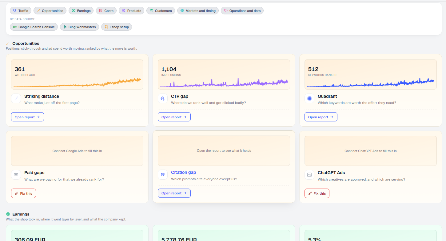
zones to read at a glance, no dividers drawn
High demand and weak position is the most actionable corner of the chart; the same demand at a strong position is worth defending. Low-demand corners are usually the lowest priority either way.
See Striking DistanceReady to see which keywords are actually worth the effort?
Free check · 7-day trial · card required