


Compare AI Share of Voice with Competitors
Compare your share of AI answers with competitors over time using the AmICited Competitors chart.
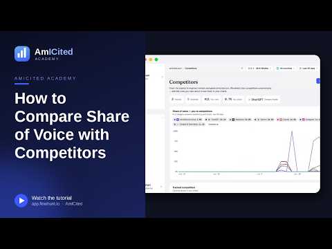
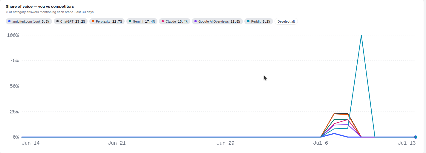
The Share of voice: you vs competitors chart is the scoreboard for your category: the percentage of AI answers that mention each brand, plotted over time, so you can see who’s winning the conversation and whether you’re gaining or losing ground.
At a Glance
- Find the chart near the top of the Competitors page, showing each tracked brand’s share of category answers over the last 30 days.
- Each line is a brand, your own flagged (you); click legend entries to isolate lines and compare yourself against a specific rival.
- Watch the trend, not a single day’s wiggle; AI outputs have natural run-to-run variance.
- Use the engine and market filters to see where your share is strongest and weakest, since share of voice is rarely uniform across platforms.
- A rising line is the goal; sharp inflection points are worth cross-referencing against Sources and Citations to find the cause.
What is share of voice in AI search?
Share of voice is the percentage of relevant answers, across a defined set of prompts, in which a given brand gets mentioned. In traditional marketing, share of voice measured advertising presence relative to competitors. In AI search visibility , the definition shifts to something more concrete and measurable: out of every answer ChatGPT, Perplexity, Gemini, or Google AI Overviews gives to your category’s prompts, what fraction of those answers name your brand versus each competitor?
This matters because AI assistants rarely present a neutral list of options the way a traditional search results page does. A single generated answer might mention three brands, one brand, or none at all, and the brands that get named repeatedly across many prompts accumulate outsized influence over buyer perception. Market share in this sense behaves less like a ranking position and more like a recurring vote: every prompt run is a chance for your brand to be cited, and share of voice tells you what fraction of those votes you’re actually winning.
The metric is inherently comparative. A single number, “we’re mentioned in 20% of answers,” is hard to interpret in isolation. Is 20% good or bad? The answer depends entirely on what your competitors are getting. AI competitive intelligence is the discipline of tracking not just your own citation performance but the whole competitive set side by side, so a share-of-voice number becomes meaningful: 20% is weak if the category leader sits at 45%, but strong if the next closest competitor is at 8%.
Share of voice also moves over time, which is where trend-tracking becomes essential. A brand’s citation presence in AI answers isn’t static: it shifts as AI models retrain, as competitors publish new content, as your own generative engine optimization work takes effect, and as the underlying sources those models draw on change. Tracking share of voice as a time series, rather than as a one-off snapshot, is what turns the metric from a vanity number into a genuine competitive-monitoring tool, one that shows you not just where you stand today, but whether the gap to the leader is closing or widening.
Where to find it
It’s the chart near the top of the Competitors page, subtitled "% of category answers mentioning each brand · last 30 days." AmICited builds this chart from the same tracked-prompt runs that power your AI rank tracker results, so the share-of-voice figures you see here are calculated from actual answers your prompt set generated across ChatGPT, Perplexity, Gemini, and AI Overviews, not from a synthetic or estimated model.
What it measures
The chart plots, for every brand in your tracked competitive set, the percentage of category answers that mention that brand across the selected time window. “Category answers” means every response generated for the prompts you’re tracking for this product area, so the denominator is consistent across all brands, which is what makes the lines directly comparable. This is what separates share of voice from a raw mention count: a competitor could be mentioned in more total answers simply because they’re tracked against more prompts, but share of voice normalizes for that by expressing everything as a percentage of the same answer pool.
Because the chart tracks multiple brands against the same denominator over the same period, it functions as a form of competitive AI benchmarking : rather than reviewing your own citation trend in isolation, you’re watching your trajectory directly against the brands your buyers are also considering.
How to read it
- Each line is a brand, colored to match the legend; your own is flagged (you).
- The y-axis is share of category answers; the x-axis is time over the selected range.
- The legend shows each brand’s current share (e.g.
amicited.com (you) 3.3%,ChatGPT 23.2%,Perplexity 22.7%) and doubles as a toggle. - A brand’s line rising means it’s being mentioned in a growing share of answers.
Reading the chart well means resisting the urge to react to a single day’s wiggle. AI model outputs have some natural variance run to run, even for the same prompt, so a one-day dip or spike in a line is often noise rather than signal. What matters is the slope of the trend across the full window. A line that’s been climbing steadily for two or three weeks is telling you something real about how that brand’s visibility is evolving; a single outlier day usually isn’t.
It’s also worth understanding what the legend percentages represent versus what the y-axis positions show. The legend gives you the most recent (or period-end) share for each brand as a quick snapshot, while the plotted line shows how that share has moved to get there. A brand sitting at a modest current percentage but with a steep upward line is a very different competitive situation than a brand at the same percentage with a flat or declining line: the first is a rising threat (or, if it’s you, a genuine win), the second is stable.
How to use it
- Watch your direction. A steadily rising line for your brand is the goal: read the trend, not one day.
- Benchmark one-on-one. Isolate your line and a specific rival’s to see whether you’re catching up.
- Spot momentum. A competitor’s line climbing fast is a signal to study what they’re doing.
- Filter to a market or engine with the top-of-page filters to see where your share is strongest and weakest.
Beyond these core moves, the chart is most useful when you turn it into a recurring habit rather than a one-time check. Reviewing it weekly or monthly, and noting when a competitor’s line breaks from its usual pattern, is how you catch a rival’s content push or a model update early, long before the shift shows up in traffic or leads. If you see a competitor’s share climb sharply after they publish a major piece of content or launch a new integration, that’s a strong candidate for a content gap analysis to figure out exactly which prompts they’re now winning that you aren’t.
The engine and market filters at the top of the page deserve particular attention because share of voice is rarely uniform across platforms. It’s common for a brand to hold a commanding share in one AI engine (say, Perplexity, which leans heavily on fresh web sources) while trailing badly in another, like Google AI Overviews, which may weight different signals. Filtering down by engine turns a single blended line into a much sharper diagnostic: instead of “we’re losing,” you learn “we’re losing specifically in Gemini,” which is a problem you can actually act on. The same logic applies to market filters if you sell into multiple regions or verticals with different tracked-prompt sets: aggregate share of voice can mask a market where you’re actually dominant, or one where you’ve fallen dangerously behind.
When you isolate your line against a single competitor’s, look for inflection points where the gap narrows or widens sharply rather than drifting gradually. Sharp moves usually correlate with something specific happening (a new page indexed, a product launch, a PR moment, or an AI model update) and are worth cross-referencing against the Sources and Citations views elsewhere in AmICited to understand the “why” behind the “what.”
Where to go next
Share of voice is most valuable when it feeds directly into what you do next, not when it’s checked in isolation. If your line is flat or falling against a competitor who’s pulling ahead, the natural follow-up is to find out exactly which prompts are driving their gains and whether you can get your brand mentioned in ChatGPT for those same queries, or to review the broader set of AI search visibility metrics and KPIs that explain the movement you’re seeing on this chart. Agencies managing this view across a whole client portfolio can see how AmICited’s solutions for agencies turn this same competitive chart into a client-ready reporting workflow, and if you’re still deciding whether structured competitor tracking belongs in your GEO stack, it’s worth comparing the approach against other AI visibility tools to see how share-of-voice tracking is handled elsewhere.
Frequently asked questions
For every brand in your tracked competitive set, it plots the percentage of category answers, across your tracked prompts, that mention that brand over the last 30 days. Because every brand is measured against the same pool of answers, the lines are directly comparable, unlike a raw mention count, which can be skewed by how many prompts a competitor is tracked against.
No. AI model outputs have natural run-to-run variance even for the same prompt, so a one-day wiggle is often noise. What matters is the slope of the trend across the full window: a line that's been climbing steadily for two or three weeks tells you something real, while a single outlier day usually doesn't.
Share of voice is rarely uniform across platforms. A brand can hold a commanding share on one engine, say Perplexity, which leans on fresh web sources, while trailing badly on another, like Google AI Overviews, which weights different signals. Filtering by engine turns a blended "we're losing" into an actionable "we're losing specifically in Gemini."
Click that competitor's name and your own in the legend to isolate just those two lines, or use Deselect all and then re-select the two you want. This strips out the rest of the field so you can see directly whether the gap between you and that rival is narrowing or widening, rather than reading it off a crowded multi-line chart.
More tutorials in this section
 How to Read Your Competitors Overview Stats
Review tracked competitors, detected brands, rank, share and category leader stats on the AmICited …
Read guide →
How to Read Your Competitors Overview Stats
Review tracked competitors, detected brands, rank, share and category leader stats on the AmICited …
Read guide →
 How Does AmICited Auto-Detect Competitors?
Learn how AmICited detects brands cited alongside you in AI answers, then review or add competitors to your …
Read guide →
How Does AmICited Auto-Detect Competitors?
Learn how AmICited detects brands cited alongside you in AI answers, then review or add competitors to your …
Read guide →
 How to Manually Add a Competitor
Add a competitor by URL in AmICited to track its domain and find keywords to monitor as prompts.
Read guide →
How to Manually Add a Competitor
Add a competitor by URL in AmICited to track its domain and find keywords to monitor as prompts.
Read guide →Ready to put it into practice?
Free check · 7-day trial · card required