


How to Track Citation Share Over Time
Track daily AI citations against competitors, spot changes and filter domains with the AmICited Citation Share chart.

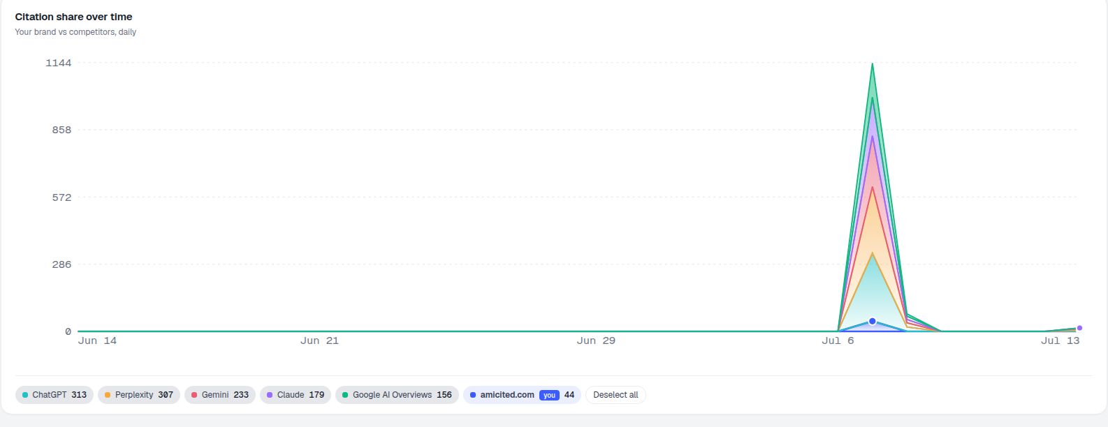
The Citation share over time chart is where you watch the trend, not just the snapshot. It plots your brand’s daily citations against your competitors’ over the selected date range, so you can see momentum building or fading.
Quick Steps
- Scroll to the Citation share over time card on the Dashboard: one line per domain, plotted daily.
- Read direction, not single dots. A multi-day rising or falling trend is the real signal.
- Click domains in the legend (or use Deselect all) to isolate your brand against one competitor at a time.
- Line up spikes with content you shipped to learn what actually earns citations.
- Widen or narrow the date range to smooth out noise or zoom into a recent change.
What is citation share, and why track it over time?
An AI citation happens whenever an AI assistant (ChatGPT, Perplexity, Gemini, or Google AI Overviews) names or links to a domain while answering a user’s question. Citation share is simply how those citations divide up among your brand and the domains competing for the same answers: if 100 citations land across a set of tracked prompts and your domain accounts for 20 of them, your citation share for that period is 20%. It’s a close cousin of share of voice , a metric borrowed from traditional brand monitoring and repurposed for generative search, where “voice” means how often you’re the source an AI model chooses to cite rather than a competitor.
A single citation count is a snapshot: it tells you where things stand today, but not whether you’re gaining ground or losing it. That’s the gap a time-series view closes. By plotting citation volume day by day instead of as one cumulative number, you can separate real, sustained movement from ordinary day-to-day noise. A brand that picks up a handful of extra citations after a single viral mention looks identical to one with genuine growing authority if you only check the total once, but their trend lines look completely different. This is the same reasoning behind AI rank tracking : a rank or a citation count checked once is a data point; checked daily over weeks, it becomes evidence of whether your generative engine optimization work is actually landing.
Tracking citation share over time also turns competitive analysis into something concrete. AI assistants don’t rank pages the way traditional search engines do: they synthesize an answer and choose which sources to cite while writing it, and that selection can shift week to week as models get retrained, content gets refreshed, or crawlers re-index a page. Watching the trend for your brand next to a named competitor shows you whether a gap is closing, widening, or holding steady, and, critically, whether specific events (a new landing page, a schema markup fix, a PR push) correspond to a bump in citations a few days later. That correlation is often the fastest way to learn what actually earns citations for your business, rather than guessing from GEO best-practice lists.
Finally, the trend view matters because AI search visibility is inherently volatile in ways classic SEO rankings aren’t. A page can rank #3 on Google for months without moving; a domain can be cited heavily in ChatGPT one week and barely mentioned the next, simply because the model sampled a different set of sources or a competitor published fresher content. Reading the shape of the line, not just its current value, is how you tell a temporary dip from a structural problem.
Where to find it
Scroll down the Dashboard to the Citation share over time card, subtitled “Your brand vs competitors, daily.” Below the chart is a legend of domains, each with its total for the period, for example ChatGPT 313, Perplexity 307, Gemini 233, Claude 179, Google AI Overviews 156, amicited.com (you) 44, plus a Deselect all control.
What it measures
The chart draws one line per domain in your tracked set (your brand plus whichever competitors you’re monitoring) and plots the number of citations each domain earned per day across the AI engines you track. It’s built from the same underlying citation events that power your overall AI visibility score, just re-sliced along the time axis instead of collapsed into a single total. That makes it the dashboard’s answer to “am I actually improving, or did last month’s number just happen to be a good day?”
Because every domain shares the same x-axis (the date range set by the filter at the top of the page) and y-axis (daily citation count), the chart doubles as a like-for-like competitive comparison: you’re not comparing your February total to a competitor’s March total, you’re comparing both on the same calendar days, under the same set of tracked prompts.
How to read it
- Each line is a domain, colored to match the legend. Your brand is included and labelled you.
- The x-axis is time (the date range set by the filter at the top of the page); the y-axis is daily citation count.
- Spikes mark days when a lot of citations landed at once, often after new content was published or re-crawled by the engines.
- Long flat stretches near zero mean little citation activity on those days.
- A rising line over several consecutive days is the signal worth acting on; a single elevated day is more likely noise from how AI engines sample sources than a real shift in your visibility.
- A falling line while competitors hold steady or rise is worth investigating before it compounds: it can point to content going stale, a competitor publishing something more citable, or a prompt set that’s drifted away from what you actually rank for.
Working with the legend
The legend isn’t just a key: it’s interactive:
- Click a domain to toggle its line on or off. Use Deselect all, then re-enable just your brand and one rival to compare the two cleanly.
- The number beside each domain is its citation total for the period, so the legend doubles as a quick ranking.
- Isolating two or three lines at a time (rather than reading all of them at once) makes it far easier to spot whether a competitor’s trend is actually correlated with a dip in yours, or whether the two are moving independently.
How to use it
- Read direction, not dots. One noisy day means little; a rising multi-day trend for your line is the real signal.
- Benchmark against a competitor. Isolate your line and a key rival’s to see whether you’re closing the gap. This is the same comparison agencies run when they need to track brand mentions in ChatGPT for a client alongside the client’s named competitors.
- Connect spikes to work. Line up jumps in your citations with content you shipped to learn what moves the needle: publishing dates, schema changes, PR mentions, or anything else you can cross-reference against the date axis.
- Change the date range at the top of the page to zoom the trend in or out. A 7-day view surfaces short-term reactions to a specific launch; a 90-day view smooths out daily noise and shows the underlying trajectory.
- Cross-check against the competitor list. If a rival’s line consistently sits above yours, use that as a prioritization signal for where to invest content or technical fixes next, rather than treating every competitor equally.
Turning the trend into action
The chart is diagnostic, not prescriptive: it tells you what happened, not what to do next. Once you’ve spotted a pattern (a competitor pulling ahead, a plateau after early gains, a spike tied to a specific page), the next step is usually to dig into which prompts are driving the movement and what those AI engines are citing instead of you. If your line is flat while a competitor’s is climbing, that’s a strong cue to run a content gap analysis against the prompts where they’re winning citations and you aren’t. If you’re just getting started and don’t yet know which metrics to prioritize beyond citation share, it’s worth reviewing the fuller set of AI search visibility metrics and KPIs that AmICited tracks alongside this chart, and pairing that with the AI rank tracker to see where in each AI answer your citations are actually landing. Either way, the goal is the same: use the trend to decide where to spend your next hour of content or technical work, then come back to this chart in a week to see whether it moved the line.
Frequently asked questions
It plots one line per domain in your tracked set, your brand plus your monitored competitors, showing daily citation counts across the selected date range. It's built from the same underlying citation events as your overall AI visibility score, just re-sliced along the time axis so you can see momentum rather than a single total.
Use the legend below the chart: click Deselect all to hide every line, then click your brand and the one rival you want to isolate to re-enable just those two. Reading two or three lines at a time makes it much easier to see whether a competitor's trend actually correlates with a dip in yours.
Spikes usually mark days when new content was published or re-crawled by the AI engines, causing a burst of citations to land at once. A single elevated day is more likely noise from how engines sample sources than a real shift in visibility, so it's worth watching whether the line stays up over several days.
Look at direction over several consecutive days rather than any single dot. A rising or falling line that holds for multiple days is the signal worth acting on; widen the date range to 90 days to smooth out daily noise, or narrow it to 7 days to see the reaction to a specific recent change.
More tutorials in this section
 How to Read Your Visibility Score
Learn what the AmICited Visibility Score measures and how its gauge and platform breakdown show your AI …
Read guide →
How to Read Your Visibility Score
Learn what the AmICited Visibility Score measures and how its gauge and platform breakdown show your AI …
Read guide →
 How to See Your Share of Voice
Find your AmICited Share of Voice and learn how it compares with your Visibility Score.
Read guide →
How to See Your Share of Voice
Find your AmICited Share of Voice and learn how it compares with your Visibility Score.
Read guide →
 How to Use the Domain Semantic Map
Explore the AmICited Domain Semantic Map to find clusters and topic gaps across prompts, fan-out queries and …
Read guide →
How to Use the Domain Semantic Map
Explore the AmICited Domain Semantic Map to find clusters and topic gaps across prompts, fan-out queries and …
Read guide →Ready to put it into practice?
Free check · 7-day trial · card required