


Track AI Brand Mentions Over Time
Track your brand’s mentions and share over time for a prompt, with a chart you can filter by AI engine.

A single citation tells you almost nothing. A trend line tells you everything: whether you’re winning a prompt, losing it, or holding steady while a competitor closes in.
Quick Steps
- The chart plots each brand’s share of mentions for one prompt over the last 30 days, including yours.
- Find it on the prompt detail page, next to the Brand mentions leaderboard.
- Use the per-engine tabs to see if a brand is climbing on one platform while fading on another.
- Watch for a steady multi-day trend, not a single day’s jump, and tie any movement to content or PR you published.
- Cross-check against the leaderboard to see if you’re gaining or losing ground on named competitors.
What is brand mentions over time?
An AI brand mention is any point in an AI-generated answer where a chatbot names, recommends, links to, or otherwise references your brand in response to a prompt. “Brand mentions over time” is simply that raw signal turned into a trend: instead of asking “was I mentioned in this one answer,” you ask “out of all the times this prompt was asked over the last 30 days, how often, relative to everyone else who was mentioned, was it me?” That relative measure is your share of voice for the prompt: your mention count divided by the total mentions across every brand that showed up in answers to that question, expressed as a percentage.
Tracking this over time matters because AI answers are not static. Large language models regenerate responses using retrieval pipelines, updated training data, and live web results, so the set of brands they cite for a given question shifts week to week, sometimes day to day. A brand that dominated a prompt in January can quietly disappear from the answer by March if a competitor publishes a more citable page, if the model’s retrieval sources change, or if your own content goes stale. Without a time series, you’d only catch that shift the next time you happened to check manually, long after the damage was done.
This is the core discipline behind generative engine optimization (GEO): treating AI answers as a ranking surface that moves, not a one-time snapshot. In traditional SEO, rank tracking tools have shown position-over-time graphs for keywords for two decades. The equivalent for AI search is prompt tracking : monitoring a fixed set of real user questions and recording, on a recurring cadence, which brands the model cites and how prominently. A brand-mentions-over-time chart is what that tracking produces once you zoom into a single prompt: a trend line per brand, so momentum becomes visible instead of anecdotal.
What makes this specifically useful, rather than just interesting, is that it separates two very different problems. A flat share-of-voice line with low volume tells you the prompt itself doesn’t generate much competitive mention activity, not much to fight over. A volatile line that swings between brands tells you the model’s source pool for that question is unstable, which usually means fresh, authoritative content can still move the needle. And a steadily climbing or declining line, sustained across many days rather than one-off spikes, is the strongest evidence you’ll get that something you did, or a competitor did, is actually working.
Where to find it
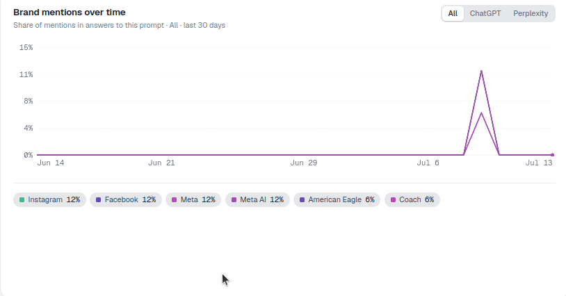
It’s the chart on the left in the middle of the prompt detail page, subtitled “Share of mentions in answers to this prompt · All · last 30 days,” directly beside the Brand mentions leaderboard.
What it measures
The chart plots share of mentions, not raw mention count, so it corrects for how “busy” a prompt is. A prompt that pulls in ten competing brands per answer will naturally produce a lower per-brand share than a prompt where only two or three brands ever get named, even if your absolute mention count is identical in both cases. That normalization is what makes the trend comparable across different time windows and across different prompts in your account: an increase from 20% to 35% share means something concrete regardless of how many total citations were flowing through the answer that week.
Because the chart is scoped to one prompt, it’s a much sharper instrument than an account-wide AI visibility score. Your overall AI visibility can be flat while individual prompts underneath it are moving in opposite directions: one climbing because of a new landing page, another sinking because a competitor shipped a comparison page that the model started preferring. The prompt-level view is where you catch that kind of offsetting movement before it shows up as “no change” in the aggregate.
How to read it
- Each line is a brand, colored to match the legend below the chart; your brand is included.
- The y-axis is share of mentions; the x-axis is time over the selected date range.
- The tabs above the chart (All, plus one per engine) let you switch between the blended view and a single engine.
- A late upward spike in your line usually means new content started getting picked up for this prompt.
- A gap or dip in every line at once usually reflects a change in how often the prompt itself returned a branded answer at all, rather than a shift between brands. Worth checking against the leaderboard beside the chart to see if total citation volume dropped.
- Multiple brands trending down together while one trends up is the clearest read you’ll get on a genuine competitive win, as opposed to noise in the model’s sampling.
How to use it
- Watch your direction, not one day. A steady multi-day rise in your share is the signal that matters; a single day’s jump is often just sampling noise in how the model generated that particular answer.
- Benchmark against a rival. Follow your line and a key competitor’s together to see if you’re gaining ground. This kind of side-by-side reading is essentially an AI visibility trend comparison scoped to one question, and it’s usually more actionable than comparing overall visibility scores because it’s tied to a specific piece of user intent.
- Tie changes to actions. Line up movements with content you published or the fan-out queries you started targeting for this prompt. If your share moved within a week or two of publishing an update, that’s a strong (though not certain) causal signal; if it moved with no corresponding action on your side, the more likely explanation is a competitor’s content or a shift in the model’s retrieval sources.
- Switch engines to find where your gains (or losses) are concentrated. ChatGPT, Perplexity, Gemini and Google AI Mode pull from different indexes and weight sources differently, so it’s common to see real movement on one engine hidden inside a flat blended line.
- Use it to prioritize, not just to report. A prompt with high total mention volume and a declining trend line for your brand is a better use of your next content sprint than a prompt where your share is already near the top and stable; the chart tells you which battles are actually still winnable.
- Cross-check against the leaderboard. The Brand mentions leaderboard next to this chart shows current standing; the trend chart shows how you got there. Reading them together tells you not just who’s ahead today but whether that lead is fresh or eroding.
Why prompt-level trends beat one-off checks
Manually pasting a prompt into ChatGPT once and eyeballing the answer is the equivalent of checking a stock price once and assuming that’s its value forever. AI answers vary run to run even for the identical question, because of model sampling and because retrieval sources update independently of any single query. A single check can’t tell you whether a mention was typical or a fluke. A 30-day trend, sampled consistently, filters that noise out and shows the underlying trajectory, which is the only version of this data that’s actually useful for deciding what to do next. This is also why an ad hoc spreadsheet of manual prompt checks tends to fall apart within a few weeks: it can’t hold a consistent cadence across dozens of prompts and multiple engines the way a dedicated AI rank tracker can.
It’s also the fastest way to answer a question that comes up constantly in competitive reviews: not “am I mentioned,” but “am I mentioned more than I was last month, and is that trend accelerating or leveling off.” If you’re trying to systematically map which questions are worth this kind of scrutiny in the first place, it’s worth pairing this chart with a process to find which prompts trigger AI to mention your brand : the trend chart is most valuable once you already know which prompts matter to your business and your competitors.
Where to go next
Once you can see a prompt’s share-of-voice trend clearly, the next useful step is deciding what to do about it, and that decision usually depends on whether the movement is about your own content or about who else is being cited alongside you. If your line is flat or declining while a named competitor’s is rising, it’s worth reading through how to track competitor AI mentions across the same engines, so you can see whether they published something new or simply got picked up by a source the model already trusted. And if you’re building a broader case for why this kind of tracking belongs in your regular reporting cycle, for your own team or for a client, particularly if you’re running this across multiple accounts as an agency , the deeper explainer on AI share of voice and how to win it walks through the formula, the benchmarks, and the tactics that actually move a trend line like this one in your favor.
Frequently asked questions
It plots each brand's share of mentions for one specific prompt over the last 30 days, including yours, as one colored line per brand. It's found on that prompt's detail page next to the Brand mentions leaderboard, and it turns a single citation check into a trend you can actually read.
Share of mentions corrects for how busy a prompt is. A prompt that pulls in ten competing brands per answer will naturally produce a lower per-brand share than one where only two or three brands ever get named, even with an identical mention count. That normalization is what makes an increase from 20% to 35% comparable across different prompts and time windows.
Above the chart are tabs for All plus one per engine (ChatGPT, Perplexity, Gemini, Google AI Mode). Switching to a single engine isolates its trend, which matters because a brand can be climbing on one engine while fading on another, a pattern the blended All view hides entirely.
A dip in your line alone next to rising competitor lines usually signals a genuine competitive loss. A dip across every brand's line at once more often reflects the prompt itself returning fewer branded answers overall, which is worth checking against the leaderboard beside the chart to see if total citation volume dropped rather than your specific standing.
More tutorials in this section
 How to Use the Fan-Out Queries Heatmap
Explore related fan-out queries for a prompt and see how well cited pages match them in AmICited’s heatmap.
Read guide →
How to Use the Fan-Out Queries Heatmap
Explore related fan-out queries for a prompt and see how well cited pages match them in AmICited’s heatmap.
Read guide →
 How to Use the Semantic Scatter Map
Explore the AI semantic scatter map to compare prompts, fan-out queries, cited URLs and your page content.
Read guide →
How to Use the Semantic Scatter Map
Explore the AI semantic scatter map to compare prompts, fan-out queries, cited URLs and your page content.
Read guide →
 Read AI Responses to a Tracked Prompt
Read the latest AI response for a tracked prompt, including the brands and sources detected by AmICited.
Read guide →
Read AI Responses to a Tracked Prompt
Read the latest AI response for a tracked prompt, including the brands and sources detected by AmICited.
Read guide →Ready to put it into practice?
Free check · 7-day trial · card required